


Author: Urjit Galera
Mentor: Dr. Tayyeb Shabbir
Bronx High School of Science
1.0 Introduction
Social Security’s Old-Age and Survivors Insurance trust fund is projected to reach insolvency by 2032 [1], forcing policy-makers to now address certain queries regarding the distribution of the program’s benefits and the process in which it collects capital. The most glaring question lies in the differences between the demographics that constitute the United States: how does the contribution-to-benefit ratio differ between demographics given each subgroup’s life expectancy, and how does this ratio impact the Social Security system(specifically the Old-Age and Survivors Insurance, also known as the OASI)? This paper examines the question, specifically within the Indian American Subgroup (U.S. residents that identify as Asian Indian). It will analyze the life-expectancy of Indian Americans to further understand how long they contribute and benefit from the Social Security trust fund along with providing a comparison to other subgroups (African Americans, Whites, Latinos, etc).
The Indian-American demographic is characterized as an anomaly from both an economic and physiological standpoint, justifying a specialized study. The median household income of Indian-Americans is $145,000, an income that is substantially higher than the median for overall Asian-Americans($100,000) [2]. The Asian-Born, first-generation subgroup also displays exceptionally high longevity, in which they have a life-expectancy significantly longer than their US-Born counterparts [3].
Beyond the anomalous nature of Indian-Americans, existing literature tends to be monolithic. That is, most studies treat Asian-Americans as a single group, disregarding the group’s immense heterogeneity; studying Indian-Americans exclusively allows for a granular understanding of how each demographic affects the Social-Security system.
An analysis of how this demographic affects the financial sustainability of the program compared to other demographics serves of great importance given the current fiscal health and poor outlook of the Social Security trust fund. Due to a variety of socio-logical and economic factors, Social Security is expected to reach insolvency by 2032-2033, with the OASI trust fund triggering automatic benefit cuts of roughly 22% [1]. Understanding which demographics are net contributors versus net beneficiaries further allows for beneficial policy-making, effectively mitigating these projected cuts in benefits.
Given that different demographics have different life-expectancies, the contribution-to-benefit ratio varies significantly between subgroups; Black-Americans, for example, generally have lower life-expectancies than other subgroups to which they receive, on average, 25 percent less benefits than White-Americans [4]. Understanding the visible disparity between demographics in the amount of benefits they collect further drives changes in policy that accommodate for each demographic’s general life-expectancy.
Ongoing debates persist regarding the reforms needed to ensure the program’s fiscal health. Some economists propose to cut the benefits retirees receive or increase the minimum age of collection, while others argue for changes on the contribution side such as an increase in the tax rate or the taxable annual earning maximum. This study aims to provide further insight into how these reforms would affect each demographic, and how each demographic is currently affecting the program.
Analyzing the effects of immigration is also a necessity. Throughout the history of the program, immigration has shown to be a major beneficiary; comprising 19% of the US labor force despite being 14.3% of the total population, immigrants strengthen Social Security’s payroll-tax base immensely. An examination of this specific population (Asian Indian U.S. residents, a population that is 66% foreign-born [5]) provides initial insight into how the demographic affects the Social Security trust fund, promoting the crucial changes that need to be made in the policy surrounding the program.
2.0 The Nature of the Social Security System
Social Security operates as a “pay-as-you-go” system; that is, it does not function as a personal savings account [6]. When one pays a Federal Insurance Contributions Act (FICA) tax, they are not accumulating money for their own future use; rather, the payroll taxes paid today directly fund the benefits for those that are currently eligible for the program (consisting of retirees, workers with disabilities, surviving spouses, and low-income individuals) [6].
The Great Depression, primarily caused by the stock market crash and systemic banking failures of 1929, put millions of Americans under immense economic strain. The disasters of the period effectively wiped out life savings for the elderly and heightened job scarcity [7]. Then, as a part of Franklin D. Roosevelt’s “New Deal” (a series of economic, social, and political reforms)[8], the 1935 Social Security Act was enacted. The legislation was renowned for providing an economic safety net for Americans; it distributed benefits for retirees funded by payroll taxes and provided a temporary income to those who lost their jobs [9]. As the country’s fiscal stress eased, the program began to broaden its scope beyond workers, and further accommodated for dependents and the disabled [10].
Contributions are collected through a mandatory payroll tax split evenly between employees and employers. As of 2026, the Old-Age, Survivors, and Disability Insurance tax (OASDI) is at a rate of 12.4%, with employers and employees each paying 6.2% of the total rate [11]; those that are self-employed are mandated to pay the full 12.4% tax rate [12]. The annual taxable income for the OASDI is $184,500, implying that employees contribute an annual maximum of $11,439 [13]. Given this wage cap, it is ineffectual to split each demographic subset based on their raw annual income for an analysis of Social Security contributions; every worker that earned an annual income above $184,500 contributes the same amount to the trust fund. Rather, each demographic subset should be stratified based on whether they pass this annual taxable income for the OASDI tax. This cap also persists for the benefits that retirees receive. A retiree’s past 35 highest annual income years is averaged into monthly earnings known as the Average Indexed Monthly Earnings(AIME); this AIME is calculated with the $184,500 cap, meaning the maximum AIME one could have is $14,358 [14]. The retiree’s AIME is then distributed through a bucket system, in which 90% of the first $1286 of the AIME, 32% of the amount between $1286 and $7749, and 15% of anything above $7749 all get summed as the retiree’s monthly benefits check [15]. This system is displayed in Table 1.
Table 1: 2026 Social Security Benefit Formula.
| AIME Portion | Replacement Rate | Maximum Amount in Bracket | Maximum Monthly Benefit |
| First $1,286 | 90% | $1,286 | $1,157.40 |
| $1,286 – $7,749 | 32% | $6,463 | $2,068.16 |
| Above $7,749 | 15% | $6,609 | $991.35 |
| Total (AIME capped at $14,358) | — | $14,358 | $4,152 |
Source: Social Security Administration, Office of the Chief Actuary, Author Made
Given the program’s pay-as-you-go nature, the system’s solvency is dependent on having enough current workers to accommodate the current beneficiaries. The program’s projected insolvency is largely due to the downward trajectory of the worker-to-beneficiary ratio. In 1960, this ratio was 5:1, meaning that for every 5 workers there was 1 beneficiary drawing out from the program. Today, the ratio has lessened to 3:1, marking a considerable decline, sparking a collective anxiety of the program’s ability to provide 100% of its promised benefits[16]. The decreasing trend in the worker-to-beneficiary ratio from 1955 to 2025, along with the predicted trend from 2025 to 2075 is shown in Figure 1.
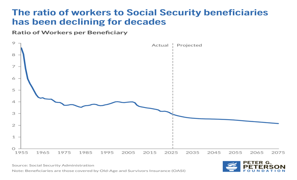
Figure 1: Ratio of Workers to OASI Beneficiaries Over Time.
Source: Peter G. Peterson Foundation, Social Security Administration
Along with the worker-to-beneficiary ratio, the average life expectancy of workers dictates the system’s financial health as it determines how long a beneficiary draws money out of the program. Decades of literature has indicated a robust relationship between one’s demographic and their life expectancy [17], further indicating that the distribution of different demographics would have a profound impact on the Social Security system [18]. Benefits may be claimed as early as age 62 and as late as age 70 (one can still start collecting benefits past 70 but their monthly payment will not increase anymore). Depending on when one begins collecting, they may see an increase or decrease in their calculated monthly benefits. To receive 100% of their calculated benefits, one must start collecting at their full retirement age which is 66 or 67 depending on their year of birth. These adjustments are actuarially designed so that a beneficiary with average life expectancy receives approximately the same total value regardless of when they claim [19]. Along with the age requirement, one has to accumulate 40 credits to be eligible for benefits in which they can earn a maximum of 4 credits yearly [19]. Assuming the annual maximum number of credits is earned each year, it would take a worker 10 years to fulfill their working requirement to receive benefits. This prerequisite also alters the way in which immigrants affect the Social Security program. Many immigrant workers enter the country and leave the country on an H-1B visa in less than 10 years, meaning they contributed to the trust fund but did not collect benefits.
3.0 Demographic Facts about Indian-Americans
First-generation Indians occupy a substantial portion of America’s foreign-born population, comprising 6 percent of the total foreign-born population of 50.2 million [20]. The growth of India’s foreign-born population has accelerated faster than the total foreign-born population’s growth; the Indian immigrant population grew 78% from 2010 to 2024 which is triple the 26% growth rate of the overall U.S. foreign born population [20]. This growth has persisted for 3 decades: since 2000, the Indian population in the U.S. has grown roughly 174%, from 1.8 million to 4.9 million [5]. Such rapid growth is consequential for the Indian-American subset’s general effect on the Social Security system as it entails a disproportionately large working population, meaning the demographic has an anomalous worker-to-beneficiary ratio. California hosts the largest Indian population(960,000), second is Texas(570,000), and the third is New Jersey(440,000)[21]. Given that Indians are the second-largest immigrant group in America [20], general statistics regarding their population are imperative to understanding the status of the Social Security system as a whole. The five states with the highest Indian population densities are shown in Figure 2.
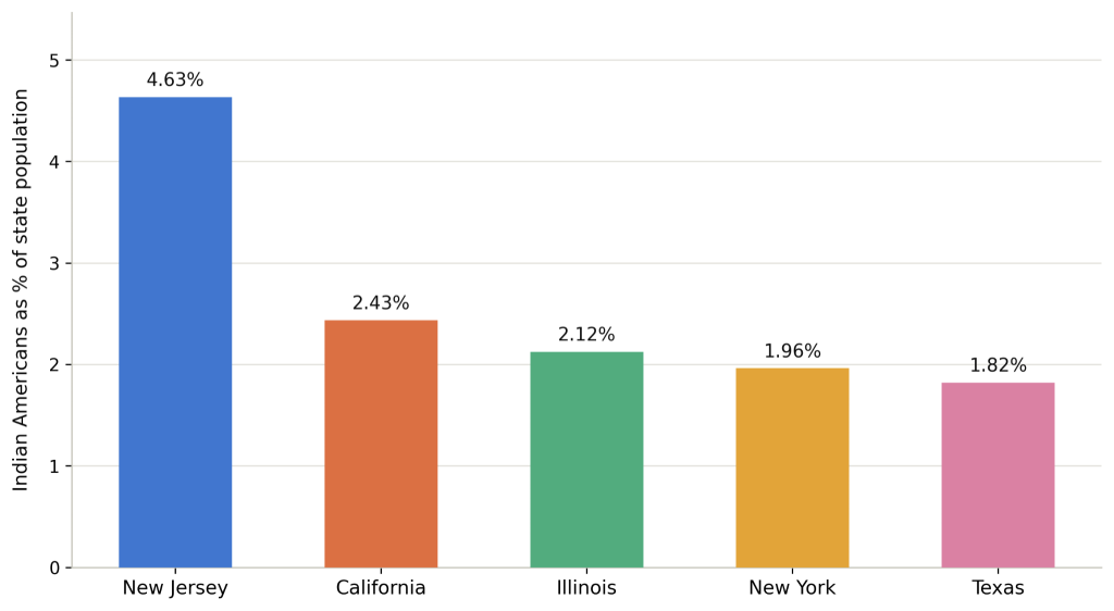
Figure 2: Indian Americans as a Percentage of the State Population (Top Five Most Indian-Populated States)
Source: New India Abroad, Pew Research Center, Author Made
66% of the Indian population in the U.S. consists of first-generation immigrants that primarily moved to the U.S. as a working young adult [22]. Indians also tend to naturalize relatively quickly: the median years that immigrants hold a green card before naturalizing is 7.5 years, while it is 6 years for the Indian demographic specifically [20]. Precisely, 51% of Indian immigrants are naturalized American citizens [21]. It is important to clarify that one does not need to be a citizen to collect Social Security benefits, but citizenship still serves as an adequate predictor of how long one will reside in the U.S.; given that immigrants generally wait 5 to 8 years to naturalize, it is likely they will live in the U.S. for a substantial amount of time. That said, 40% of Indian-Americans are now considering moving out of the United States, primarily due to three factors: frustration with the political climate under Donald Trump (58% of the 40%), rising cost of living(54% of the 40%), and personal safety concerns(41% of the 40%) [23]. Still, literature has indicated that Indians who live in the U.S. for a substantial amount of time tend to rarely leave the country.
The age distribution of Indian Americans tends to be skewed towards the working age adults, indicating more years of payroll tax contribution relative to their population size. Indeed, the median age of Indian immigrants is about 41 which is younger than most immigrant groups [24], while the median age of the overall Indian American population is 34.2. The median age for U.S. born Indian Americans is 13.4, and six-in-ten U.S.-born Indian Americans are under 18 with just 1% being 65+ [5]; this statistic further underscores the young, soon-to-be worker majority of this Indian-American population, in which the demographic has a large worker-to-beneficiary ratio that will persist for some time.
Indian Americans have a bachelor’s degree attainment rate of 78%, the highest of any origin group in the country [25]. The highly-educated nature of the demographic is further accentuated with the statistics regarding the distribution of occupations and income within the demographic. 75% of employed Indian immigrants worked in management, business, science, and the arts compared to the 36% of all U.S. immigrants overall [26]. 21% of all active U.S. physicians are Asian, and with India being the single largest source country for international medical graduates, it’s reasonable to assume there would be a relatively high concentration of Indian doctors in America [27]. Indian American households have the highest median income of any ethnic or racial group in the U.S., registering a median income of $151,200 in 2023, an income well above the $105,600 median income for the overall Asian American population [5].
3.1 Life Expectancy Data for Indian Americans vs. Different Demographic Groups
Life Expectancy serves as the central variable in connecting demographic composition to Social Security’s financial outlook as it determines how much time a beneficiary draws out of the program. As of 2023, national life expectancy stood around 78.4 years overall, having risen 0.9 years from 77.5 in 2022 as the country was in the midst of recovering from the Covid-19 pandemic [28]. The recovery from the pandemic was not uniform across demographics, in which Whites had an expectancy of 78.4 years during 2023 and Hispanics had an expectancy of 81.3 years; African-Americans had the lowest expectancy of 74.0 years despite experiencing a substantial increase from previous years driven by decreased mortality from Covid-19, heart disease, homicide, diabetes, and cancer [29]. Asians Americans consistently rank the highest in life-expectancy amongst other demographics within the country; in 2023, Asians had a staggering expectancy of 85.2 years [29]. These life expectancies for the four demographics in 2023 are displayed in Figure 3.
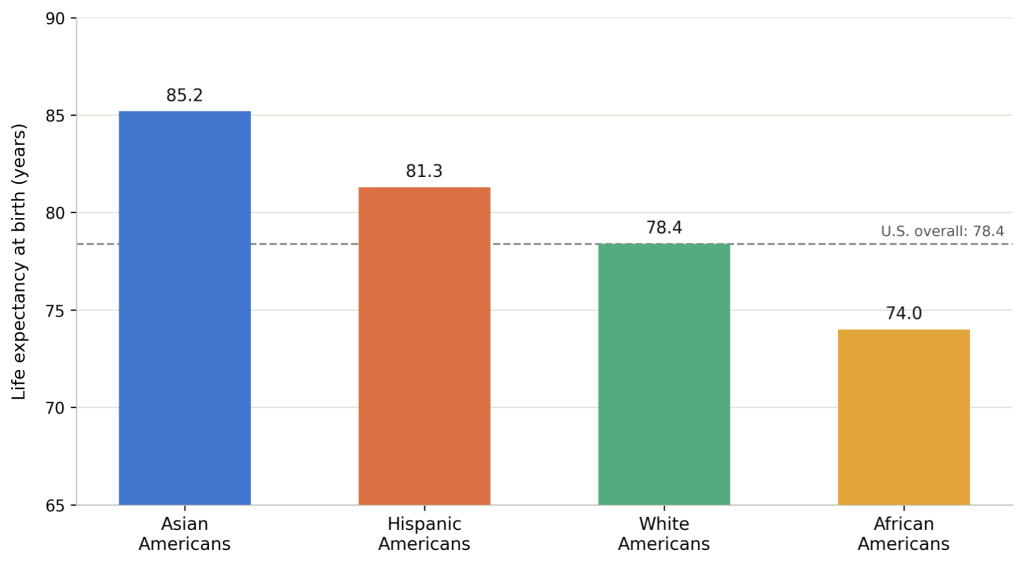
Figure 3: Life Expectancy at Birth by Demographic Group, 2023
Source: CDC NCHS, KFF, Author Made
As mentioned earlier, however, analyzing the statistics of Asian Americans as a whole offers limited utility. The “Asian American” category treats Chinese Americans, Vietnamese Americans, and Indian Americans all as statistically inseparable even though these subsets of the Asian American population have vastly different statistics in their socioeconomics and health outcomes. Using National Vital Statistics System mortality data and American Community Survey population estimates from 2012–2016, Baluran and Patterson found that life expectancy at birth varied for as much as a decade between these different Asian American demographics, with the Vietnamese American population having a life expectancy of 77.5-79.7 years while the Chinese American population have a life-expectancy of 86.8-91.3 years [30]. This range in life-expectancy even exceeds the difference between White and Black populations in America. Baluran and Patterson ranked the life expectancies of the six largest Asian American subgroups from greatest to least: Chinese, Indians, Koreans, Japanese, Filipinos, and the Vietnamese [30]. Their paper did not include the specific life expectancy range for Indians.
This places Indian Americans well above the average expectancy for Asian American demographics, but also substantially higher than White, Black, and Hispanic populations. It’s worth mentioning, however, that Indian Americans fall behind Chinese Americans, a rather unexpected finding given the two demographics’ socioeconomic characteristics. As previously stated, Indian American households have the highest median income of any ethnic or racial group in the U.S.[5], and the highest rate of bachelor’s degree attainment of all six Asian subgroups [31], raising questions as to why they do not rank the highest in life-expectancy. Literature has confirmed, however, that the correlation between socioeconomic status and life-expectancy, while strong, is not perfect [31]. Ranking highly within the socioeconomic hierarchy does not entirely translate to an increased life-expectancy [31].
Along with this, Asian Indian Americans do not necessarily have an upwards trend in life expectancy. In their study, Zheng used the years of life lost metric (YLL) to measure the gap between how long someone actually lives and how long they could’ve lived (this age is capped at 84) [31]. The YLL increased by 1.52 years for Asian Indian men with a bachelor’s degree and by 1.1 years for Asian Indian women with a bachelor’s degree. Among men without a bachelor’s degree, Vietnamese, Korean, and Asian Indian Americans experienced the largest YLL increases, ranging from 2.37 to 3.74 years, from 2000–2004 to 2020–2022 [31]. For women without a bachelor’s degree, YLL increased by 0.22 years among Asian women overall, and the Asian increase was mainly driven by Vietnamese, Korean, and Asian Indian women. The Covid-19 pandemic was not the primary culprit of this pattern, as the unfavorable YLL pattern was already evident before the pandemic, between 2000–2004 and 2015–2019.[31] Zheng traces 75% of the shortfall amongst Asian ethnicities to three specific causes of death: circulatory diseases (heart disease/stroke), cancer, and diabetes [31]. The changes in years of life lost for each race from the study is shown in Figure 4.
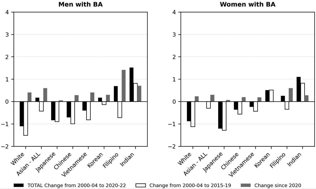
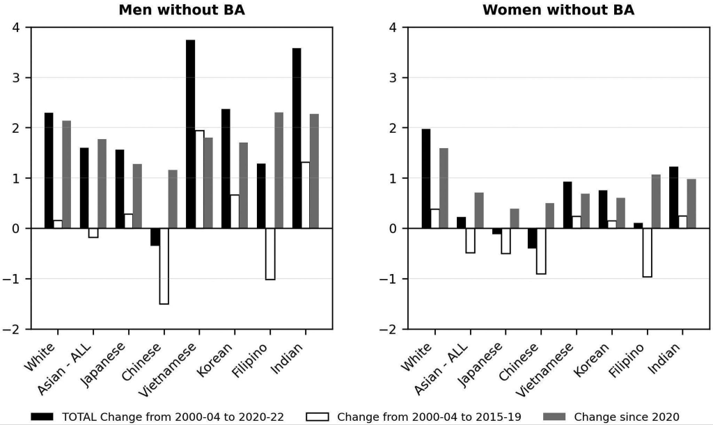
Figure 4: Change in Years of Life Lost by Race/Ethnicity, Sex, and Education, 2000–2022, Decomposed by Pre-Pandemic and Pandemic Periods.
Source: Zheng et al. (2026)
Heart disease, in fact, has proven to be somewhat of a commonality amongst Indians. Indian Americans tend to have a substantially higher frequency of attracting heart disease relative to other Asian subgroups, particularly ischemic heart disease. Literature has indicated that these levels of heart disease are associated with hypertension, diabetes, smoking, and central obesity [32]. Utilizing NCHS mortality data from 2003-2012, one study found that Indian American men lost an average of 17 years of life to ischemic heart disease, and 724 years of potential life per 100,000 population in 2012 alone, a notably higher figure than other Asian subgroups [33]. This increased risk of cardiovascular disease amongst the Indian demographic could likely be the primary reason as to why their life expectancy underachieves given their socio-economic well-being.
The “healthy immigrant” phenomenon likely plays a factor into why Indian Americans have a substantially higher life expectancy compared to Indians that reside in India [34]. Immigration is an arduous process, requiring a certain threshold of physical health and material wealth. To immigrate, one needs to pass several medical screenings as they may face rejection if they were tested to be ill, frail, or have a chronic untreated condition [35]. Furthermore, one would generally need to have some level of affluence before immigrating, and are usually required to have a guaranteed employment route once they reach America. The H-1B Visa (71% of all H-1B visas go to Indian nationals [20]), for instance, requires that Indian immigrants have a bachelor’s degree and a job offer from a U.S. employer [36]. Given that education and income has a direct, positive correlation with health outcomes[37], it’s fair to assume that many of the immigrants that fulfill the H-1B Visa requirements are healthy and would generally have an extended life-expectancy. This healthy immigrant phenomenon effectively filters the Indian population, choosing the healthiest and most affluent to come to America[34].
4.0 Impact on the Social Security System of the IA data
To make a direct, comparable measure of each demographic group’s contribution to the OASI trust fund, the OASDI tax formula(6.2%) was applied to each demographic’s year-round median individual full-time earnings. Individual earnings were used instead of household income as the tax rate is levied on individuals, not households. The median individual earnings for Indian Americans, the broader Asian American population (including Indian Americans), African Americans , Hispanic Americans, and White Americans were calculated from the U.S. Census Bureau’s 2024 American Community Survey 1-year Public Use Microdata Sample (PUMS) [38]. Census-assigned person weights were applied to each respondent, as each respondent’s earnings represented an estimated, varying number of U.S. residents’ earnings. The median individual earnings for all demographic groups are from 2024 and expressed in 2024 dollars. It is worth noting that the figures drawn from this dataset throughout the study are independently calculated estimates derived from sample data rather than official published statistics. The median full-time individual earnings and annual social security contributions by demographic group is shown in Table 2.
Table 2: Median Full-Time Individual Earnings and Annual Social Security Contributions by Demographic Group, 2024.
| Demographic Group | Median Full-Time Individual Earnings | Annual FICA Contribution (Employee Share, 6.2%) |
| Indian Americans | $111,678 | $6924.04 |
| African Americans | $50,762 | $3147.24 |
| Hispanic Americans | $48,732 | $3021.38 |
| White Americans | $65,991 | $4091.44 |
| Asian Americans (including Indian Americans) | $81,220 | $5035.64 |
Source: U.S. Census Bureau’s 2024 American Community Survey 1-year Public Use Microdata Sample (PUMS), Author Made
At the median, Indian Americans contribute more than double the amount contributed by Hispanic/Latino and African American workers. The income disparities between demographics are especially visible when looking at each group’s annual payroll tax dollars. Indian Americans also contribute substantially more than the broader Asian American aggregate ($6924.04 vs. $5035.64), further underscoring how extracting statistics for the entire Asian population substantially understates the economic position of the Indian subgroup specifically. Every group’s median individual earnings sit well below the $184,500 cap, meaning their total earnings proportionally translate to how much they contribute to the program.
For each demographic, calculating the proportion of full-time, year-round workers whose annual earnings exceed the $184,500 taxable maximum is necessary to understand what share of each subgroup contributes to the program proportional to their annual earnings, versus what share is shielded above the cap. Using the same 2024 ACS PUMS dataset as the previous section, this analysis calculates that percentage for each demographic group. The share of full-time workers earning above the social security taxable maximum by demographic group is shown in Table 3.
Table 3: Share of Full-Time Workers Earning Above the Social Security Taxable Maximum by Demographic Group, 2024.
| Demographic Group | % of Full-Time Workers Above $184,500 Cap |
| Indian Americans | 13.84% |
| African Americans | 1.34% |
| Hispanic Americans | 1.53% |
| White Americans | 4.03% |
| Asian Americans (including Indian Americans) | 7.57% |
Source: U.S. Census Bureau’s 2024 American Community Survey 1-year Public Use Microdata Sample (PUMS), Author Made
While it was established that no demographic’s typical worker has their earnings exceed the $184,500 maximum (as indicated by the analysis on the median full-time individual earnings for each demographic), the proportion of Indian Americans that do earn past this maximum is substantially higher than the other subgroups; at 13.84%, Indian Americans are capped at more than three times the rate of White workers (4.03%), roughly nine times the rate of Hispanic workers (1.53%), and over ten times the rate of Black workers (1.34%). Notably, Indian Americans also exceed the cap at nearly double the rate of the broader Asian American aggregate (7.57%); this further underscores how pan-ethnic Asian statistics substantially understate the affluent economic status of the Indian subgroup.
This finding has a direct and counterintuitive implication for the wage-cap framework established earlier in this paper: for this specific 13.84% of the Indian American population, a portion of their true earnings is not captured by the Social Security tax, meaning their contribution to the program understates their true income advantage relative to other groups. Analyzing a median-based comparison therefore does not account for this nuance as the Indian demographic’s aggregate contributions to the trust fund are not directly proportional to their full economic standing. Indeed, a substantial share of the demographic’s total earning power goes untaxed as it sits above the cap. Nevertheless, Indian Americans remain among the top contributing demographics examined in this paper. Because a larger share of the population reaches the taxable maximum than any other group, more Indian American workers pay the full $11,439 ceiling contribution than in any other demographic.
4.1 Duration of Contribution
It is essential to establish a general idea of what proportion of each demographic is old enough to be collecting Social Security benefits versus still within the working age. To do so, the percentage of each demographic that is 67 years or older was calculated; 67 was chosen as the baseline age for calculating the metrics as it is the full retirement age when one can receive 100% of their benefits[39]; it is important to clarify, however, that different demographics may begin collecting benefits at different ages due to a variety of the mentioned factors such as income. The median age was also calculated for each demographic to understand how close each group is, on average, to the retirement age. Both metrics were calculated using the same 2024 ACS PUMS dataset used for the previous contribution metrics to ensure relative consistency.
Table 4: Median Age and Share of Population at Full Retirement Age (67+) by Demographic Group, 2024.
| Demographic | Percentage of Demographic that is 67+ years old | Median Age |
| Indian Americans | 7.4% | 36.1 |
| African Americans | 11.0% | 36.2 |
| Hispanic Americans | 6.8% | 31.2 |
| White Americans | 18.2% | 43.2 |
| Asian Americans (including Indian Americans) | 11.7% | 39.0 |
Source: U.S. Census Bureau’s 2024 American Community Survey 1-year Public Use Microdata Sample (PUMS), Author Made
As shown in Table 4, Indian Americans currently skew heavily toward the working age rather than retirement age relative to most other groups examined. At a median age of 36.1, Indian Americans are more than seven years younger than White Americans (43.2), and only 7.4% of the Indian American population has reached the full retirement age, the second-lowest share of any group in Table 4. This distribution suggests that the Indian American demographic currently has a very small share of its population collecting benefits, with the overwhelming majority still contributing. These findings are anticipated as large-scale immigration from India is relatively recent [20]. Along with this, the typical age at which one immigrates to the U.S. is around 31 [40] (this age is not Indian-immigrant specific). Since newly arrived immigrants enter the country as a young adult and large-scale Indian immigration has only recently begun, it is expected that most Indian Americans have not lived to reach the full retirement age of 67.
A separate but relevant question from each population’s current age composition shown in Table 4 is how long a newly arrived Indian immigrant specifically needs to remain in the U.S. before becoming eligible for benefits in the first place. This requires connecting the 40-credit/10-year work requirement to the age at which Indian immigrants typically arrive. Approximately 60% of Indian immigrants have resided in the U.S. for 10 or more years [5]; while it is important to clarify that living in America for 10 or more years does not inherently mean these immigrants were employed for 10 or more years, this suggests that a large portion of the demographic has had sufficient time in the country to meet the eligibility threshold.
Van Hook and Zhang’s analysis of immigrant emigration patterns further provides context as to how many immigrants work in the U.S. long enough to pass the eligibility threshold. They reveal that emigration is most common among immigrants in their first 0-4 years of U.S. residence. Once immigrants surpass the 10-14 year mark, they are 30-33% less likely to emigrate, which is the same window in which 40-credit eligibility is typically achieved [41]. Since roughly 60% of Indian immigrants have already resided in the U.S. for 10 or more years, a substantial share of Indian immigrants who arrive as working-age adults likely accumulate the 40 credits to qualify for their Social Security benefits. Those that don’t achieve the 40 credit threshold for eligibility are classified as the “Contribute and Leave” population, the subgroup of working Indian immigrants that annually contribute for as long as they reside in the U.S. but cannot claim payments from the program. The exact total dollar value of contributions made by this group is currently unavailable, and the statistics needed to manually calculate this figure (such as the number of people within this group) are also not accessible in published sources.
It’s important to also account for the population of Indian Americans that reside in a different country after retirement. For Social Security retirement benefits specifically, if these Indian Americans are U.S. citizens they can receive payments while living anywhere in the world, with only a small list of restricted countries as exceptions. For non-citizens, however, they cannot receive payments for any month in which they have been outside the U.S. for more than six consecutive months, unless they meet specific exceptions (as mentioned previously) [42].
Medicare, by contrast, does not transfer the same way. Medicare generally does not cover any medical care received outside the United States, regardless of citizenship status or years of U.S. residence. If a retiree who was eligible to claim Medicare benefits returns to India, they could not use it for care received at a hospital in India. This means a returning Indian American retiree’s earned Social Security cash benefit remains payable in India, but their earned Medicare health coverage effectively does not. This implies that the total value of benefits actually accessible to a returning retiree is less than the full value of what they contributed across both programs, further complicating the contribution-to-benefit ratio for the Indian American demographic.
4.2 Life Expectancy Translated Into Years of Collection
Life expectancy helps determine how many years a beneficiary is expected to draw from the OASI trust fund after becoming eligible.
Life expectancy for each demographic in 2024 was calculated combining two data sources: one providing mortality data, and the other providing population counts. Mortality data were obtained from the Centers for Disease Control and Prevention’s CDC WONDER Multiple Cause of Death, 2018–2024, Single Race database, which provided 2024 all-cause death counts by age and race. Corresponding 2024 population estimates by age and race were obtained from the same 2024 ACS PUMS dataset used for the prior calculations.
Age was grouped into year intervals: <1, 1–4, 5–9, … 95+. The death rate for each of these age groups was calculated by combining the mortality data with the age-specific population estimates. This rate was then converted into a death probability for a hypothetical set of 100,000 people per demographic. For each age group, the number of individuals expected to survive was carried forward to the next age interval. Total years lived was then calculated for each age group by multiplying the number of hypothetical individuals in that age group by the interval length, while subtracting the years not lived by individuals who died before the interval ended. Thus, individuals who survived the entire interval contributed the full number of years in that interval, whereas individuals who died contributed only the estimated portion of the interval that they lived. The total years lived metric for each age group was summed and divided by the original hypothetical population of 100,000 to obtain the life expectancy at birth for the given demographic.
Years of expected benefit collection were calculated by subtracting 67 (the age that was previously used for the age distribution metrics) from life expectancy, allowing for a consistency across the different calculated metrics. The calculated life expectancy at birth and years of expected benefit collection by demographic group is shown in Table 5.
Table 5: Calculated Life Expectancy at Birth and Years of Expected Benefit Collection by Demographic Group, 2024.
| Demographic | 2024 calculated life expectancy at birth | Years of expected benefit collection |
| Indian Americans | 86.2 | 19.2 |
| African Americans | 74 | 7 |
| Hispanic Americans | 82.3 | 15.3 |
| White Americans | 78.7 | 11.7 |
| Asian Americans (including Indian Americans) | 85.8 | 18.8 |
Source: CDC WONDER’s Multiple Cause of Death, 2018–2024, Single Race database and U.S. Census Bureau’s 2024 American Community Survey 1-year Public Use Microdata Sample (PUMS). Author Made
Some variation from each demographic’s true life expectancy is expected as these estimates reflect mortality conditions in 2024 alone rather than a multi-year average, and they are calculated estimates derived from sample data. The calculations also utilize two separate data systems, further increasing the figures’ potential error. These inconsistencies may partially explain the narrow gap between Indian American and Asian American life expectancy, a gap that literature has indicated to be wider.
Despite these inherent limitations in the calculations, the figures still underscore the general distribution of life expectancies between demographics. Indian Americans, with the highest calculated life expectancy at 86.2 years, are expected to draw from the OASI trust fund for 19.2 years after reaching full retirement age, nearly three times as long as African Americans (7.0 years), who have the lowest life expectancy of any group examined at 74.0 years. The gap between these two groups amounts to 12.2 additional years of benefit collection, a difference that compounds substantially when multiplied across a beneficiary’s monthly payments.
These figures highlight one of the primary concerns regarding the program’s distribution of benefits. A benefit formula that is uniform for each demographic produces unequal lifetime returns between demographics once differential mortality is accounted for. Two workers of different ethnicities with identical earnings histories and contributions would still likely receive a different amount of benefits primarily because they live differing amounts of time, which varies systematically across demographic groups (as indicated in this study).
Notably, the ordering of groups by years of benefit collection does not align with the ordering of groups by contribution established earlier in this section. Hispanic Americans, who had the lowest median individual earnings ($48,732) and therefore the lowest annual contribution of any group examined, are nonetheless expected to collect benefits for 15.3 years; this is 3.6 years longer than White Americans, who contribute substantially more annually. African Americans contribute more annually than Hispanic Americans yet are expected to collect for less than half as long. This misalignment between contribution capacity and collection duration is precisely what makes the contribution-to-benefit ratio a more informative metric than either variable examined in isolation.
Indian Americans, conversely, contribute the most annually of any demographic examined, while also being positioned to collect benefits for the longest period. Whether this results in a net-positive or net-negative position relative to the trust fund depends on the demographic’s contribution-to-benefit ratio.
4.3 Contribution-to-Benefit Ratio for Indian Americans
Utilizing the 2024 ACS PUMS dataset, the annual earnings were first capped at the taxable maximum of $184,500; the cap needs to be implemented when calculating any contribution or benefit amounts as all residents earning above the cap are effectively contributing and benefiting the same amount to the program. After this cap was applied, the average annual earnings was calculated for all Indian U.S. residents which was $70,658.65. These earnings produce a contribution-to-benefit ratio of either 0.25 or 0.51, depending on whether the employer’s matching contribution is counted. On the employee side alone, a worker earning this amount pays $4,380.84 annually in payroll taxes, amounting to $153,329.27 over an assumed 35-year career. Counting the employer’s matching 6.2%, total contributions to the trust fund on that worker’s behalf reach $8,761.67 annually and $306,658.54 across the same period. On the benefit side, this earnings level yields an AIME of $5,888.22, which the bend-point formula converts into a monthly benefit of $2,630.11 at full retirement age. Multiplied across the 19.2 years of expected collection established earlier, this produces a total lifetime benefit of $605,977.50. The Contribution-to-Benefit Ratio for Indian Americans, along with the metrics used to calculate the ratio are shown in Table 6.
Table 6: Contribution-to-Benefit Ratio for Indian Americans, 2024
| Input | Value |
| Average annual earnings (capped) | $70,658.65 |
| Years of expected benefit collection | 19.2 |
| Lifetime contribution — employee share | $153,329 |
| Lifetime contribution — combined | $306,659 |
| Monthly benefit at full retirement age | $2,630.11 |
| Total lifetime benefit | $605,978 |
| Ratio — employee share only | 0.25 |
| Ratio — combined employee + employer | 0.51 |
Source: Author’s calculations using U.S. Census Bureau 2024 ACS 1-Year PUMS and Social Security Administration benefit parameters
The employee-share ratio of 0.25 reflects the individual worker’s perspective: an Indian American retiree is projected to receive roughly four dollars in lifetime benefits for every dollar withheld from their own paycheck. The combined ratio of 0.51 reflects the trust fund’s perspective, accounting for the full 12.4% the program actually receives, and indicates that Indian Americans are projected to collect approximately twice what is paid in on their behalf. The combined ratio is the more appropriate measure for analyzing the demographic’s effects on the program’s solvency since it includes the total share of what is being contributed towards the program, combining both the employee and employer share. For analysis of the effects on the individual, the employee-share ratio is the measure of importance as it isolates the employee’s burden and benefits from the total share.
Under both measures, the final ratio falls well below 1.0, indicating that Indian Americans are projected to receive more in lifetime benefits than is contributed on their behalf. Given the high income of Indian Americans, they tend to be the highest contributors to the program. Nevertheless, they also tend to collect benefits for the longest, primarily due to their simultaneously high life expectancy. Because of this, the demographic’s contribution-to-benefit ratio is still unfavorable to the trust fund even while they provide substantial contributions. It is also important to note that the AIME benefit formula is inherently structured to favor lower earners; because the replacement rate declines from 90% to 32% to 15% as AIME rises, each additional dollar of earnings produces proportionally less additional benefit, while the same 12.4% tax applies to every dollar below the cap.
5.0 Policy Implications
After analyzing the income and age distribution of each subgroup, along with a calculated contribution-to-benefit ratio for Indian Americans specifically, two policy questions are worth analysis. Is it defensible for the program to be distributing lifetime benefits unevenly on the basis of life expectancy, an uncontrollable variable that varies substantially between each person and subgroup? Secondly, which populations strengthen the trust fund’s position, and which strain it?
No single reform clearly addresses both questions. Indeed, attempting to solve one persisting limitation of the program may worsen another. Indian Americans contribute more per worker than any group examined. Their high life expectancy, however, means they are projected to collect substantially more than what is paid on their behalf, marking a strain on the trust fund. African Americans occupy the reverse position: their short expected collection period eases pressure on the fund, but it also means they proportionally recover less of what they contributed than any other group, through no choice of their own. When examining reform options on both sides of the program, it is important to note that gains on one aspect of the program comes at the expense of the other.
5.1 Reform Options Bearing on the Contribution Side
A frequently proposed reform lies in the $184,500 taxable maximum. Literature indicates that increasing or completely removing this cap would improve the solvency of the program, but may lead to adverse effects beyond the program. In their study, Bagchi used a life-cycle general-equilibrium framework to evaluate the effect of eliminating this cap, finding that eliminating the cap would limit potential future benefit reductions to under 4%, compared to nearly 12% if the cap remains in place. This improvement would come at the cost of high earners potentially saving and working less, which would reduce labor, capital, output, and overall welfare[43].
Removing the cap would fall unevenly across demographic groups. Referring back to Table 3, the Indian American demographic has the highest percentage of high earners compared to the other groups, with 13.84% of Indian American full-time workers earning above the taxable maximum; removing the cap would therefore disproportionately draw from Indian American earnings as the 13.84% of Indian American workers that exceed the threshold would then have to contribute directly proportional to their earnings. Conversely, this cap removal would have little effect on the African American demographic where only 1.34% of their population is currently above the threshold. Indeed, removing the taxable maximum would affect each demographic to substantially different degrees.
Completely removing the cap may weaken incentives for human-capital investment, where workers feel less inclined to be more productive and skilled [44]. The more modest and less radical approach would be to partially increase the taxable maximum, meaning those earning above the current threshold would contribute more, though still not on all of their earnings. This increase would still disproportionately affect each demographic but not to the same extent as full removal would.
Adjusting the tax rate is also a potential solution to remedying the program. In their study, Kitao modeled the effects on the program if the contribution rate were to increase to 16.4% split evenly between the employer and employee (compared with the original 12.4%)[45]. Raising the rate to 16.4% would directly increase payroll-tax revenue, improving program solvency. With this rate increase, however, consumption and capital are predicted to fall 5.5% and 5.3% respectively. Along with this, the average hours worked is expected to rise by 2.1% and the average work life would increase from 44.0 to 44.5 years [45]. This approach would likely appeal to middle-older aged workers who are nearing their retirement; this age group will only be paying the increased tax rate for a little period of time while still receiving all of their promised benefits, including the benefits during the time in which they contributed through the original 12.4% tax rate. Younger workers would likely oppose this reform because they will have to contribute relatively more over a longer period of time while receiving the same benefits that they would have originally received through the 12.4% tax rate. It is important to clarify that each demographic will still proportionally contribute different amounts of money due to the different percentages of people in each demographic that pass the taxable maximum threshold.
5.2 Reform Options Bearing on the Benefit Side
Raising the full retirement age is also a commonly proposed benefit-side reform, delaying the time-frame in which one could begin collecting their benefits. Much like the contribution-side reforms, however, these reforms would fall unevenly across demographic groups.
Increasing the age at which one can collect benefits will uniformly decrease the total years retirees collect their benefits for, meaning less money is drawn out of the program. While this would alleviate some of the current fiscal stress of the program, it would also create a burden for retirees. The Social Security Administration estimates that raising the full retirement age to 68 would close 23% of the program’s actuarial imbalance, while raising it to 70 would close 31%. Still, these changes would reduce average benefits by roughly 6.8% and 18.6%, respectively [46]. These benefit reductions have differing degrees of severity for each demographic group. For Indian Americans, raising the full retirement age to 68-70 would still translate to between 16.2 and 18.2 years of benefit collection, a substantial collection period. African Americans would face a much worse change if the retirement age increased to 68-70; their expected years of benefit collection would drop to between 4 and 6, marking a 14% to 43% reduction from the already low original years of benefit collection they had.
Another reform that could be made on the benefit side is to modify the bend-point benefit formula itself. Modifications could be applied in two ways: lowering the existing replacement rates, or subdividing the current brackets into additional tiers. Under the latter approach, for instance, the 15% rate currently applied to all earnings above $7,749 might be replaced by an 8% rate on earnings between $7,749 and $8,500 and a 7% rate on earnings above $8,500. Monthly benefits would be reduced through both modifications, though it is important to also account for how it burdens lower and higher earners. The previously stated example (the subdivided 15% into 7% and 8% tiers) would be classified as a progressive reform, as it would reduce benefits primarily only for higher earners, leaving those below the $7,749 threshold unaffected. Conversely, lowering the initial 90% replacement rate would substantially hurt lower earners, as much of their AIME falls within the initial $1,286.
Adjusting this formula provides a potentially viable and sustainable approach to managing how much money is drawn out of the program, but it is important to recognize how each modification to the formula would influence the existing wage gap and affect groups across income levels and demographics. A reform like this would also be correcting for earnings differences, not life-expectancy differences, though it may somewhat offset those life-expectancy differences (this would not fully offset those disparities, as the paradoxical cases discussed earlier demonstrate that life expectancy does not reliably track earnings. Hispanic Americans, for instance, have the lowest median earnings of any group examined yet the second-longest expected collection period).
5.3 What These Findings Do Not Support
This study does not support a demographically-differentiated benefit formula. Adjusting one’s contribution rate, bend-point formula, assigned retirement age, or taxable maximum based on their ethnic demographic is legally impermissible. Beyond this approach’s unethical nature, it would also not effectively remedy the program’s growing insolvency. Studies analyzing each demographic’s contributions or benefits from the program rest on group averages and general life expectancies, studying patterns from aggregate outcomes; these generalized analyses say nothing about how long any particular individual will live. Any reform responding to these disparities must therefore operate through variables the program already recognizes (earnings, claiming age, contribution history) rather than through demographic classification itself.
6.0 Concluding remarks and Further Research
This paper examined the interaction between life expectancy, demographic characteristics, and contribution-to-benefit patterns in order to assess the current condition of the Social Security program, its projected trajectory, and the reforms available to address its long-term solvency. This analysis focused particularly on the Indian-American demographic given their anomalous characteristics and their frequent aggregation into a single ‘Asian American’ category that obscures variation between Asian subgroups.
The findings indicate that Indian Americans occupy a distinctive position on both the contribution and benefit side of the program. They contribute more per worker than any group examined and have the highest share (13.84%) of workers above the taxable maximum out of the examined groups. They also have the highest calculated life expectancy at 86.2 years, yielding 19.2 expected years of benefit collection. Their combined contribution-to-benefit ratio of 0.51 indicates they collect roughly twice what is paid in on their behalf. Contribution capacity and collection duration do not align across groups, and neither variable alone describes a group’s relationship to the program. Because benefits are paid for as long as a beneficiary survives, life expectancy is a key determinant for how much a worker receives their benefits.
These conclusions rest on stated constraints: independently calculated life expectancy estimates, an assumed flat 35-year earnings history, and ratios describing group averages that cannot be attributed to individuals. These limitations point towards future work that could be done. Probabilistic modeling through a Monte Carlo approach would replace this paper’s fixed assumptions with distributions of earnings, career length, and mortality, producing ranges rather than point estimates. In the future, studies specifically analyzing second-generation Indian Americans would also provide insight into how this group will affect long-term solvency. Beyond the Indian American demographic, this disaggregation analysis could be applied to other Asian subgroups that are aggregated into the single ‘Asian American’ category.
Disaggregating the Indian American population from a broad statistical category revealed a group that is simultaneously the program’s largest per-worker contributor and among its largest net beneficiaries.The comparison across groups further showed that contribution capacity and collection duration move independently of one another, meaning that a program applying identical rules to every participant returns those contributions unequally, along a dimension the benefit formula does not measure. With the trust fund projected to reach insolvency within the decade, the window for reform is narrowing faster than the groundwork required to guide it, making further research on the program’s sustainability an increasingly urgent prerequisite rather than a refinement to be pursued afterward.
References
- Picchi, Aimee. “Social Security Insolvency Now Projected for 2032, Putting Benefits at Risk of a 22% Cut.” Cbsnews.Com, 9 June 2026, https://www.cbsnews.com/news/social-security-trust-fund-insolvency-2032-trustees-report/.
- Pew Research Center. “Indian Americans: A Survey Data Snapshot.” Pew Research Center, 6 Aug. 2024, https://www.pewresearch.org/2024/08/06/indian-americans-a-survey-data-snapshot/.
- Mehta, Neil K., et al. “Life Expectancy Among U.S.-Born and Foreign-Born Older Adults in the United States: Estimates From Linked Social Security and Medicare Data.” Demography, vol. 53, no. 4, July 2016, pp. 1109–34, https://doi.org/10.1007/s13524-016-0488-4.
- Johnson, Richard W, and Karen E Smith. “Limitations on Social Security Benefits for Black Retirees: Exploring Structural Racism’s Impact.” Urban Institute, 20 Apr. 2023, https://www.urban.org/research/publication/limitations-social-security-benefits-black-retirees.
- Budiman, Abby. “Indians in the U.S. Fact Sheet.” Pew Research Center, 29 Apr. 2021, https://www.pewresearch.org/race-and-ethnicity/fact-sheet/asian-americans-indians-in-the-u-s/.
- Peterson Foundation. “Budget Basics: How Does Social Security Work?” Peterson Foundation, 27 Nov. 2024, https://www.pgpf.org/article/how-does-social-security-work/.
- FDR Library. “Great Depression Facts – FDR Presidential Library & Museum.” Fdrlibrary.Org, Franklin D. Roosevelt Presidential Library and Museum, 2016, https://www.fdrlibrary.org/great-depression-facts.
- Pan, Guanchen. “Analysis of Roosevelt’s New Deal: The Decisive Role the Government Should Play When Facing the Crisis.” Lecture Notes in Education Psychology and Public Media, vol. 4, no. 1, EWA Publishing, May 2023, pp. 405–09, https://doi.org/10.54254/2753-7048/4/2022101.
- “Social Security.” LII / Legal Information Institute, https://www.law.cornell.edu/wex/social_security.
- “Public Benefits for People with Disabilities | Financial Resilience Center.” National Disability Institute, https://www.nationaldisabilityinstitute.org/financial-resilience-center/benefits/.
- Social Security Administration. “FICA & SECA Tax Rates.” Www.Ssa.Gov, https://www.ssa.gov/oact/progdata/taxRates.html.
- “FICA Tax: What Does It Mean and How Is It Calculated?” Paychex, https://www.paychex.com/articles/payroll-taxes/how-to-calculate-fica-rate.
- Social Security Administration. “Contribution and Benefit Base.” Ssa.Gov, 2025, https://www.ssa.gov/OACT/COLA/cbb.html.
- Social Security Administration. “Social Security Benefit Amounts.” Www.Ssa.Gov, https://www.ssa.gov/oact/cola/Benefits.html.
- “Primary Insurance Amount.” Www.Ssa.Gov, https://www.ssa.gov/oact/COLA/piaformula.html.
- Peterson Foundation. “The Ratio of Workers to Social Security Beneficiaries Is at a Low and Projected to Decline Further.” Peterson Foundation, 29 Oct. 2024, https://www.pgpf.org/article/the-ratio-of-workers-to-social-security-beneficiaries-is-at-a-low-and-projected-to-decline-further/.
- Dwyer-Lindgren, Laura, et al. “Life Expectancy by County, Race, and Ethnicity in the USA, 2000–19: A Systematic Analysis of Health Disparities.” The Lancet, vol. 400, no. 10345, July 2022, pp. 25–38, https://doi.org/10.1016/S0140-6736(22)00876-5..
- Hendley, Alexa A, and Natasha F Bilimoria. “Minorities and Social Security: An Analysis of Racial and Ethnic Differences in the Current Program.” Social Security Bulletin , vol. 62, no. 2, 1999, https://www.ssa.gov/policy/docs/ssb/v62n2/v62n2p59.pdf.
- Social Security Administration. “Benefits Planner: Retirement | Retirement Age and Benefit Reduction | SSA.” Www.Ssa.Gov, 2023, https://www.ssa.gov/benefits/retirement/planner/agereduction.html.
- Batalova, Jeanne, and Ari Hoffman. “Indian Immigrants in the United States.” Migrationpolicy.Org, Migration Policy Institute, 7 Dec. 2022, https://www.migrationpolicy.org/article/indian-immigrants-united-states.
- Kumar, Arun. “Indian Americans Second-Largest Asian Group in the US: Pew.” The American Bazaar, 6 May 2025, https://americanbazaaronline.com/2025/05/06/indian-americans-second-largest-asian-group-in-the-us-pew-462477/.
- “Indian Americans Now 2Nd Largest Asian Group in US Pew.” New India Abroad, 2024, https://www.newindiaabroad.com/english/features/indian-americans-now-2nd-largest-asian-group-in-us-pew.
- Singh, Ritu. “American Dream Fading? 40% Of Indian Americans Consider Leaving The US, Survey Reveals Top Reasons.” Www.Ndtv.Com, NDTV, 23 Apr. 2026, https://www.ndtv.com/feature/american-dream-fading-40-of-indian-americans-consider-leaving-the-us-survey-reveals-top-reasons-11396699.
- “VisaVerge.” VisaVerge, 3 May 2025, https://www.visaverge.com/india/indian-american-population-in-us-reaches-new-record-census-shows/.
- theworldstatisticswebsite@gmail.com. “Indian Population in US 2025 | Statistics & Facts – The World Data.” –, 14 Oct. 2025, https://theworlddata.com/indian-population-in-us/.
- “Asian Indian Immigrants | EBSCO.” EBSCO Information Services, Inc. | Www.Ebsco.Com, 2020, https://www.ebsco.com/research-starters/social-sciences-and-humanities/asian-indian-immigrants.
- MyAsianVoice. “1 In 5 Medical Doctors in the U.S. Are Asian – MyAsianVoice.” MyAsianVoice, 6 Dec. 2024, https://www.myasianvoice.com/1-in-5-medical-doctors-in-the-us-are-asian.
- Arias, Elizabeth, et al. National Vital Statistics Reports, vol. 74, 2025, https://www.cdc.gov/nchs/data/nvsr/nvsr74/nvsr74-06.pdf.
- KFF. “Life Expectancy at Birth Increased Across All Race and Ethnicity Groups In Recent Years, Erasing the Declines Experienced During the COVID-19 Pandemic.” KFF, 6 Mar. 2026, https://www.kff.org/racial-equity-and-health-policy/racial-disparities-in-life-expectancy/.
- Baluran, Darwin A., and Evelyn J. Patterson. “Examining Ethnic Variation in Life Expectancy Among Asians in the United States, 2012–2016.” Demography, vol. 58, no. 5, Sept. 2021, pp. 1631–54, https://doi.org/10.1215/00703370-9429449.
- Zheng, Hui, et al. “Heterogeneity in Asian Americans’ Mortality Trends, 2000–2022.” The Journals of Gerontology Series B, vol. 81, no. 2, Oxford University Press, Dec. 2025, https://doi.org/10.1093/geronb/gbaf248.
- Kaur, Prabhdeep, et al. “Risk Factors for Cardiovascular Disease in Rural South India: Cohort Study.” BMJ Open, vol. 9, no. 10, Oct. 2019, p. e029759, https://doi.org/10.1136/bmjopen-2019-029759.
- Iyer, Divya G, et al. “Years of Potential Life Lost Because of Cardiovascular Disease in Asian-American Subgroups, 2003-2012.” Journal of the American Heart Association, vol. 8, no. 7, 2 Apr. 2019, p. e010744, https://doi.org/10.1161/JAHA.118.010744. PubMed Central.
- Riosmena, Fernando, et al. “Explaining the Immigrant Health Advantage: Self-Selection and Protection in Health-Related Factors Among Five Major National-Origin Immigrant Groups in the United States.” Demography, vol. 54, no. 1, Duke University Press, Jan. 2017, pp. 175–200, https://doi.org/10.1007/s13524-016-0542-2.
- may. “Why You May Need to Provide Evidence You Are in Good Health.” Immigration New Zealand, 2022, https://www.immigration.govt.nz/process-to-apply/applying-for-a-visa/providing-evidence-and-documents-to-support-your-visa-application/health-requirements/why-you-may-need-to-provide-evidence-you-are-in-good-health/.
- U.S. Citizenship and Immigration Services. “H-1B Specialty Occupations, DOD Cooperative Research and Development Project Workers, and Fashion Models | USCIS.” Www.Uscis.Gov, 5 Feb. 2021, https://www.uscis.gov/working-in-the-united-states/h-1b-specialty-occupations.
- “Understanding the Relationship Between Education and Health – NAM.” NAM, 21 Nov. 2024, https://nam.edu/perspectives/understanding-the-relationship-between-education-and-health/.
- United States Census Bureau. “Explore Census Data.” Census.Gov, https://data.census.gov/table/ACSDT1Y2024.B20017D?g=010XX00US.
- “A Guide on Taking Social Security.” Schwab Brokerage, https://www.schwab.com/learn/story/guide-on-taking-social-security.
- “Immigrants Are Coming to America at Older Ages.” CIS.Org, https://cis.org/Report/Immigrants-Are-Coming-America-Older-Ages.
- Van Hook, Jennifer, and Weiwei Zhang. “Who Stays? Who Goes? Selective Emigration Among the Foreign-Born.” Population Research and Policy Review, vol. 30, no. 1, Apr. 2010, pp. 1–24, https://doi.org/10.1007/s11113-010-9183-0.
- “Social Security Payments Outside the United States.” Social Security Administration, https://www.ssa.gov/international/payments.html?tl=0.
- Bagchi, Shantanu. “Can Removing the Tax Cap Save Social Security?” The B.E. Journal of Macroeconomics, vol. 17, no. 2, June 2017, https://doi.org/10.1515/bejm-2016-0091.
- Blandin, Adam. “Human Capital and the Social Security TAX CAP.” International Economic Review, vol. 62, no. 4, Wiley, June 2021, pp. 1599–626, https://doi.org/10.1111/iere.12525.
- Kitao, Sagiri. “Sustainable Social Security: Four Options.” Review of Economic Dynamics, vol. 17, no. 4, Elsevier BV, Oct. 2014, pp. 756–79, https://doi.org/10.1016/j.red.2013.11.004.
- “Distributional Effects of Accelerating and Extending the Increase in the Full Retirement Age.” Social Security Administration Research, Statistics, and Policy Analysis, https://www.ssa.gov/policy/docs/policybriefs/pb2011-01.html.
About the author
Urjit Galera
Urjit is a senior at the Bronx High School of Science. His deep interest in economics and social welfare policy paired with his Indian-American background is what drove him to pursue this research. Through this project, Urjit aims to show how disaggregating broad demographic categories reveals patterns that aggregate data conceals, bringing greater precision to debates over Social Security’s future.
He hopes to continue his research endeavors in university, exploring the intersection of public health, economics, and data science.