
Author: Yi Zou
Shanghai Starriver Bilingual School
June 1, 2021
1. Introduction
Curious about what affects the death rates of respiratory diseases, especially for young children, I use statistics to discover the factors related to the death of respiratory diseases, such as region, income group, and the trend in recent 20 years. Wondering whether there may be a link between air pollution and respiratory diseases death rate, I also explore some data on PM2.5, the suspended particles in the air with a diameter less than 2.5 microns. RStudio is used to process, visualize and analyze data.
2. Explanation of Data Sources
Generally, three data sources are used, one about the deaths of lower respiratory diseases, one on populations, and the other on PM2.5 – the links are attached in the end, in the reference list.
The first source is on the deaths of lower respiratory diseases from World Health Organization. This source contains the data on the number of children’s death from different diseases in different countries from 2000-2017, with the purpose of finding the causes of children deaths to increase children survival. According to World Health Organization (n.d.), while it has data from “civil registration with complete coverage (80% or over) and medical certification of cause of death, or nationally representative epidemiological studies of causes of child death”, it also has some kinds of estimations from WHO and the Maternal Child Epidemiology Estimation group (MCEE), using the original data and computing it with regard to the proportion of population of young children. Also, for low-mortality countries without adequate data, a multinomial model is applied; for high-mortality countries without adequate data, “a multinomial model applied to (largely) verbal autopsy (VA) data from research studies” is used. Useful data can be extracted from this, as the number of children deaths on lower respiratory diseases can be attained through filtering, and the age group is filtered to be 0-4 years. In this case, the data of the deaths of lower respiratory diseases can be attained.
The second source is on population, from The World Bank. As it’s reasonable for countries with greater population to have more deaths from lower respiratory diseases, it’s necessary to attain the data on population. In this data set, we have population from different countries in 1960-2019. The population here is about all residents, either citizens or legal status, and it’s a midyear estimate. Also, what’s important here is the metadata of this data set, which categorizes countries by region and income group (Worldbank, n.d.). The categorization of income group is based on its GNI per capita (Serajuddin and Hamadeh 2020).
Last but not least, data on PM2.5 can also be attained from The World Bank. It’s about the exposure of PM2.5 air pollution in micrograms per cubic meter. The exposure is calculated from mean annual concentrations of PM2.5 and the population in the region (Brauer et al, 2017).
3. Data Analysis
3.1 Preparation Work
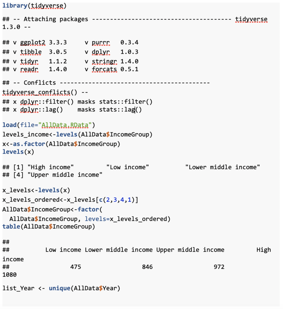
To begin with, some preparation work was necessary. The tidyverse package was loaded, and also a RData file, named “AllData”, for the prepared data that has been cleaned and processed orderly was loaded. Also, the income group was reordered from high income group to low income group, instead of mere alphabetical order. Meanwhile, a list of years has been created for later usage.
3.2 What Affects Death Rate in a Given Year
3.21 Death VS Population Plot
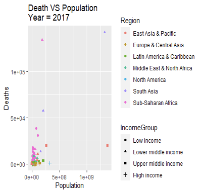
For this first plot, this is about Deaths VS Population. It appears that the direct plot of 2017 is hard to analyze since many dots are extremely near each other (and same for other years).
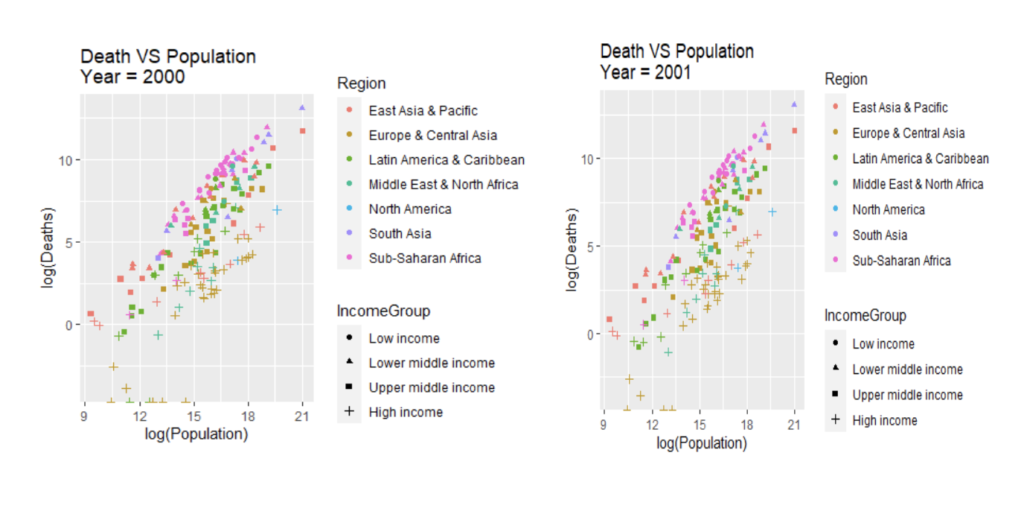
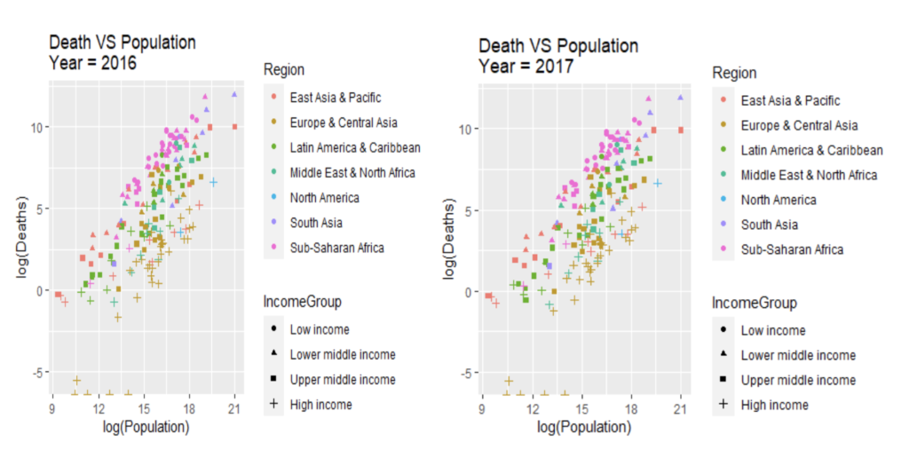
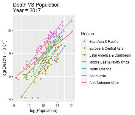
Therefore, both deaths and population have been taken log in order to make the plots more wide-spread for better analysis, which is gg1. The plot appears to be related to region. In the plot of 2017, it can be discovered that most dots at the top of every vertical line are in pink, which indicates that with the same population, regions of Sub-Saharan Africa tend to have more deaths of lower respiratory diseases. For those at the bottom, they are likely in yellow, which shows that they are in Central Asia or Europe. Also, there are some correlations with income groups as well. Dots at the top are likely to be in either circle or triangle, indicating that they are in either lower or lower-middle income. Also, for almost all the dots that are at the bottom, they are in plus sign, which shows that countries in high income usually have less deaths. This pattern appears the same throughout the years, and its correlation with income group is even stronger in earlier years. Therefore, its relationship with regions and income groups can really be further explored.
Regression lines for different regions in 2017 are drawn here. Since some death values are 0 and can’t be logged, all death values are added by 0.01, so that those values can be shown on the graph while the graph aren’t being affected too much. It appears that the linear regression here works well, as most points fall near the line, so the lines fit the regions well. The regression lines of most regions follow the pattern of the same slope, meaning they have the similar death rates, especially the red line, about East Asia & Pacific. Also, some distinctions between regions can be observed, such as Sub-Saharan Africa is often at the top, indicating a higher death rate while North America, Europe & Central Asia are always at the bottom, with a relatively lower death rate. Also, the variation can be observed, as pink dots of Sub-Saharan Africa are closer to the line, indicating higher death rates are consistent across those countries, while the yellow dots of Europe & Central Asia are more wide-spread, so that variation occurs – there are even several dots at the very bottom of the graph.
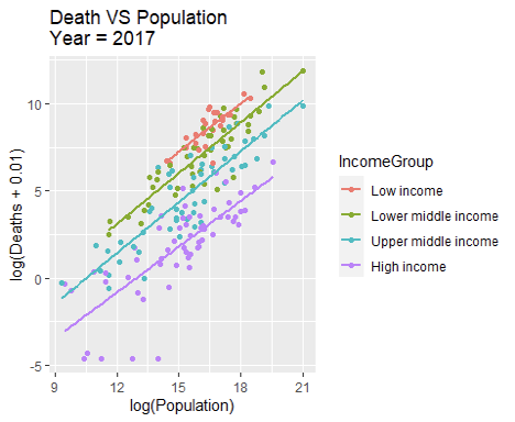
Next, the regression lines for different income groups in 2017 are drawn using the similar method, and the difference is even more distinct – there are no crosses and intercepts of any two lines. At any population level, the deaths from lower respiratory diseases are always higher at lower income countries and decreases as the income group goes from low to high. Also, it appears that each income group has a fixed death rate and there is smaller spread or outliers, besides the five higher-income countries with an extremely low death rate.
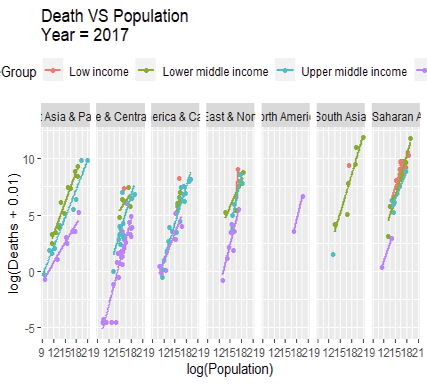
After that, in order to see how important the factor of income group is, the death per population in a specific region is plotted by income group. In general, the distinctions between lines in each region are clear, with lower income at top and higher income at the very bottom. However, we do have some lines tangling together, and one possible reason is that there are few data available here. For example, there are only two red plots (lower income) in “Middle East & North Africa”, so its regression line is definitely highly inaccurate, affected by one outlier. However, in a more general perspective, the death per population is still highly related to the income level, which shows that economic factors still play an important role in this process.
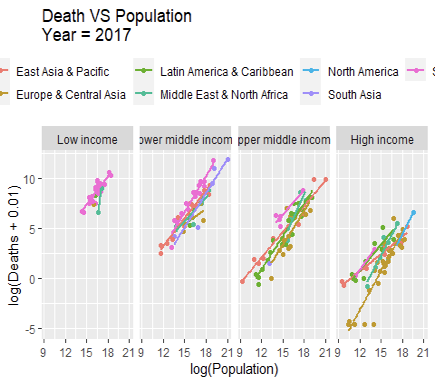
Similarly, the death rate in a specific income group by region can be plotted. In all the four graphs below, there are lots of tangles between the lines, and the differences between the lines aren’t very significant, while the differences between income groups are rather more significant, as the slope become steeper from higher income groups to lower income groups (besides the several outliers in high income groups in Europe & Central Asia). However, there are some subtle distinctions here that the pink line, about Sub-Saharan Africa, is usually slightly higher than other regions, even in the same income group; meanwhile, the yellow line, about Europe & Central Asia is slightly lower than others in the same income group. Perhaps these interesting facts are due to something besides economic factors, and related to some environmental and geographical factors. Besides, there may be some inaccuracy here due to lack of data, as there are only two pink dots (Sub-Saharan Africa) in high income countries, one light green dot (Latin America & Caribbean) in low-income group.
3.22 Display Death Rate Directly
Then in order to evaluate the ratio of deaths and population directly, a new variable of “Death / Population” (dividing deaths by population) is created, which is literally the death rate.

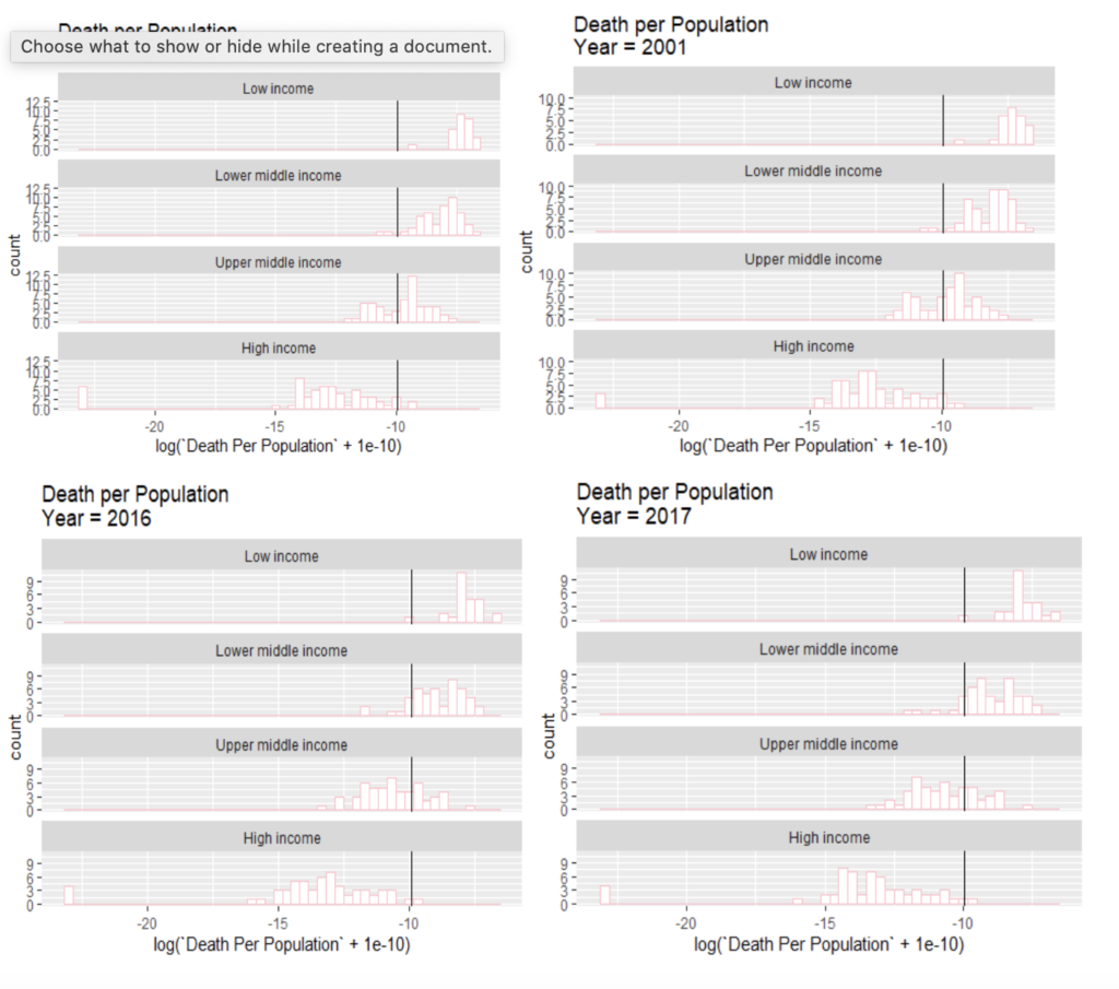
Firstly, the histograms of the logs of death rates by different income groups are plotted. It’s necessary to mention here that since some countries have 0 deaths, the death rate value can be 0 – so all values are added by 0.0000000001 ( ) to make those value appear on the graphs (same process is done for all plots below related to the new variable of “Death / Population”, which won’t be repeated later). As shown in the plot of 2017, the difference between different income groups is vast. Lower income countries have a significantly higher death rate than higher income groups. The low income has almost all countries greater than the median death rate (except one outlier, which is Syrian Arab Republic). Lower-middle income has majority of countries’ death rate higher than median value while higher-middle income has majority to be lower than median value. For high income countries, they are almost all below median death rate (except one outlier, Nauru). This shows the direct link between income groups and death rates. Also, for low-income groups, the data appears to be more concentrated, mostly between -9 to -7 on the histogram. However, for upper middle income countries and high income countries, their data are pretty wide-spread. Therefore, this reveal that the variations of death rates between different richer countries are greater than in poorer countries. Perhaps this is due to some environmental factors, or people’s attitudes towards the lower respiratory diseases in developed countries, since economic factor is no longer significant when the comparison occurs inside one income group and all countries are rich.
Similar situations can be observed throughout the years from 2000 to 2017 – the general pattern is rather static. However, such distinction between income groups does become clearer throughout the years. In earlier years, the difference of the pattern between lower middle income and low income isn’t as significant as it is today while for upper middle income, the death rate is half greater than median, half smaller than median. At that time, the advantage of high income countries is massive. Perhaps this is a good thing that through the recent decades, middle income countries become better and better at health care so that they have a relatively lower death rate in those years. However, problem still remains for lower income countries.
3.3 Trend of Death Rates Throughout the Years
3.31 In a Given Country
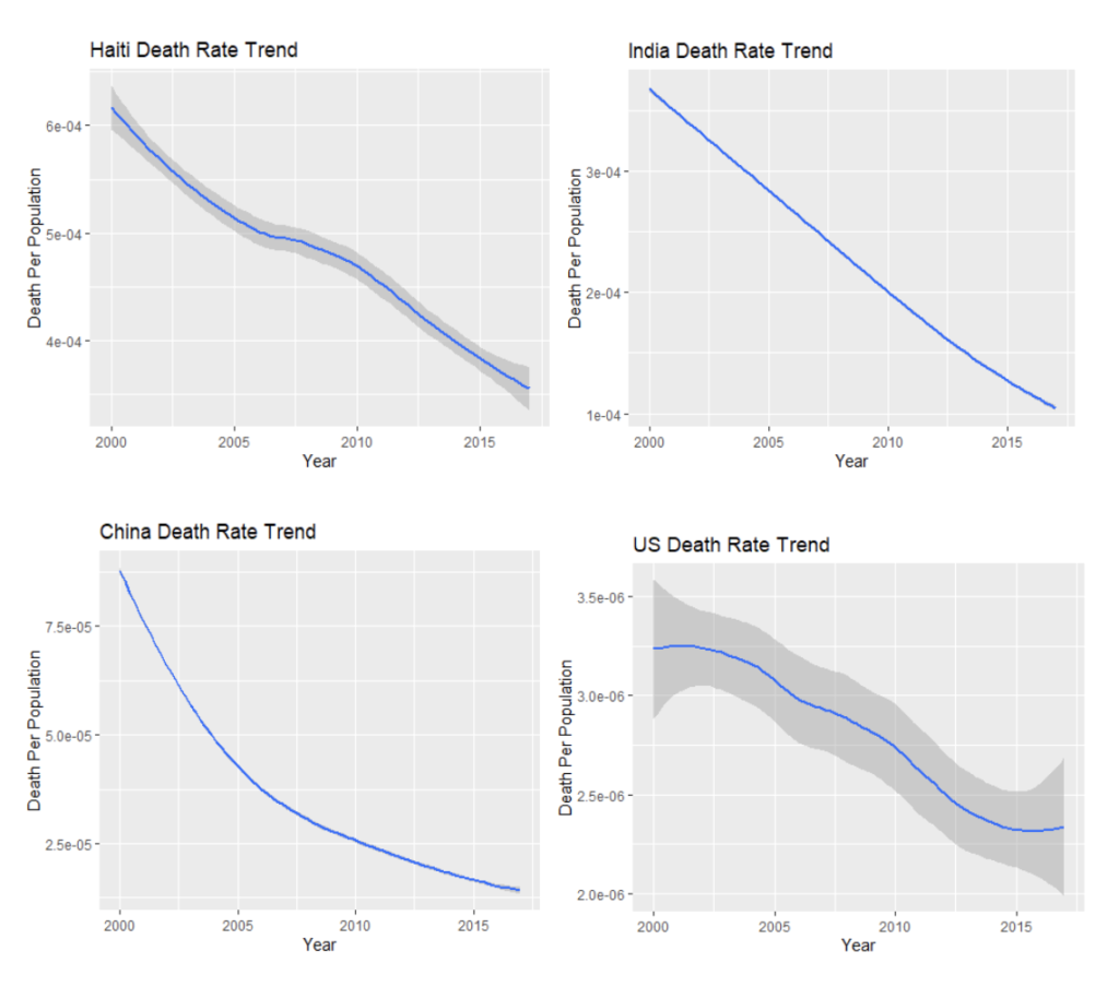
To begin with, the trend of death rates in several countries are explored – US, China, India and Haiti are selected, representing different income groups and different regions. It’s exciting to discover that all four countries experience a significant decrease in the death rate in 2000-2017. Also, it appears that countries in relatively lower income groups (such as India and Haiti) have a much sharper decreasing trend, almost linear. For China, as upper middle income, its death rate decreases intensively and the curve is growing flatter over time, just as a parabola. For US, the high income, the decreasing trend is much flatter and there are more twists and turns in the 18 years.
3.32 By Income Group
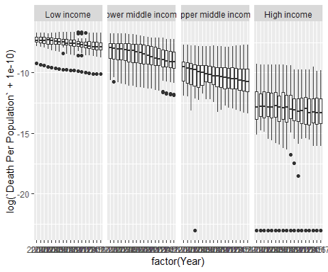
After that, a boxplot of different income groups’ death rate trend by year has been made. Obviously, throughout the years, the death rate of lower income countries is always higher than higher income countries and all of them are decreasing over time. The death rate of lower-middle income and upper-middle countries are decreasing steadily and most intensively among all income groups.
For low-income countries, they do decrease constantly in the 18 years, but the scale is relatively small, so their death rates still stay high over the years. However, we have an outlier here among low-income countries, always lower than usual low income boxplots, which is Syrian Arab Republic (Syria).
For high income countries, the decrease over the 18 years isn’t significant though, and there are a lot of twists and turns throughout the decreasing process. However, what’s impressive is that there are several countries that have death rate to be 0 for years (revealing here: , which is the set of dots at the very bottom). For the dot that decreases intensively from 2009-2011, it’s Andorra – the country decreases intensively and steadily in those years and the death rate becomes 0 since 2012. Besides, countries such as Iceland, Cyprus also have multiple years of death rate being 0.
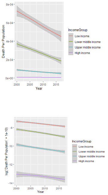
Besides the boxplot, geom_smooth is also used to regress the lines for different income groups. The first graph is what I plot at first, without log. While all income groups are drawn in one graph, the low income countries appear to decrease dramatically, and the slope is flatter for middle incomes and almost totally flat for high incomes. Also, the gray confidence interval for mean death rate appears wide-spread for low income countries while tiny for high income countries.
This is confusing, since from all my exploration above, high income countries’ death rates are often widespread and differ from each other a lot. Perhaps it’s because we didn’t take log at this graph. So the second graph is plotted by taking the log of the death rate. This time, as predicted, the gray confidence interval is extremely big for high income countries; this gray confidence interval is relatively small for low income countries. Also, the decreasing trend is most intensive in middle income countries, which is consistent with what we’ve observed in the boxplots. The reason behind is possibly related to the percentage of the decrease: for middle income countries, they experience a dramatic decrease in their percentage of death rates in log scale, while lower income countries, although decreasing a lot in number, don’t have a significant decrease in the percentage. Besides, it appears that in any cases, the gray confidence interval is always constant throughout the years, revealing that the changing rate of the death rate is often constant throughout the years.
3.33 By Region
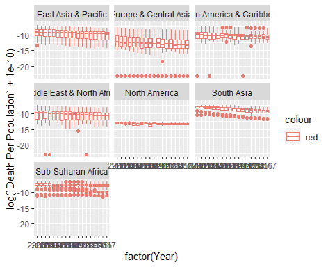
Using the same method, the boxplot for different regions throughout the years can be drawn as well. For all regions, the decreasing trend isn’t as significant as income groups, but still exists. Europe & Central Asia and North America typically have low death rates, and Europe & Central Asia contains some countries with death rate of 0. In contrast, South Asia and Sub-Saharan Africa countries usually have higher death rates. However, they often have several outliers with death rate lower than usual. Probably this result is also somehow related to the economic situation, as Europe & Central Asia or North America has countries typically of high income or upper middle income while South Asia or Sub-Saharan Africa are typically of lower income groups.
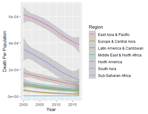
Also, the smooth plot for different regions is here. Still, without log scale, regions with higher death rates (Sub-Saharan Africa & South Asia) decreases more intensively.
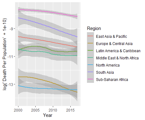
Things become uncertain after it’s logged. South Asia appears to decrease the most greatly this time and Sub-Saharan Africa is flat this time. East Asia & Pacific decreases slightly but steadily over time. For other regions, it’s no longer linear, as the line goes up and down and even the decreasing trend is unclear, showing that on a general level, the change in percentage doesn’t vary much by regions.
3.4 About PM2.5
As respiratory diseases are related to respiratory system, and the health of respiratory system is easily affected by air pollution, an assumption is made initially that there may be some links between the death rate of lower respiratory diseases and PM2.5 exposure. This is explored with the PM2.5 data.
3.41 By Income Group
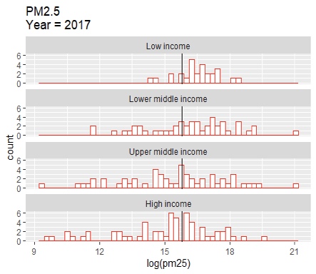
Firstly, the relationship between PM2.5 exposure and income groups is analyzed, as shown in the histogram below. For lower income groups, they are more likely to have a higher PM2.5 exposure than the median value. This is consistent with the initial assumption and observation of death rate, as lower income groups have a higher death rate. However, when it comes to higher income groups, for countries in upper middle income and high incomes, their PM2.5 exposure spreads almost evenly on the two sides of the median value. Meanwhile, for death rate of respiratory diseases, both two income groups are always on the smaller side compared to the median value. So this makes people question whether there is really a link between PM2.5 exposure and death rates.
3.42 By Region
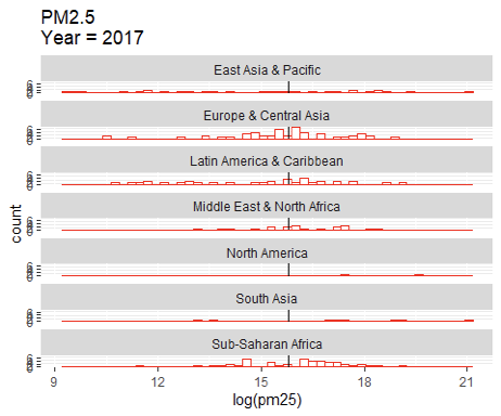
For the histogram of PM2.5 by regions, similar situation occurs. For Sub-Saharan Africa and South Asia, countries are likely to have a higher PM2.5 exposure than median and they are the regions with higher death rates. However, for Europe & Central Asia, it’s evenly spread on both sides of the median value. For North America, it’s even greater than the median value. At the same time, the two regions have the least death rates among all, which is out of the original expectation.
3.43 Trend of PM2.5 through Time
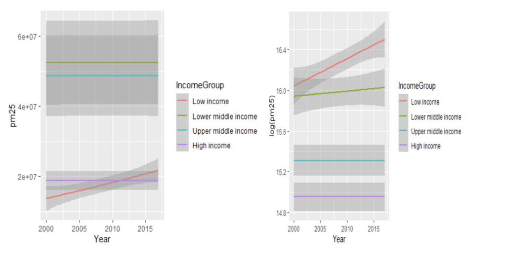
The following two graphs are about PM2.5 and income groups, not logged and logged. In either case, the lower income group increases greatly while all other income groups mostly remain constant and may increase a little bit. This reveals that the original assumption may not be correct, since PM2.5 generally increases while the lower respiratory diseases death rates decrease dramatically over time, among all income groups.
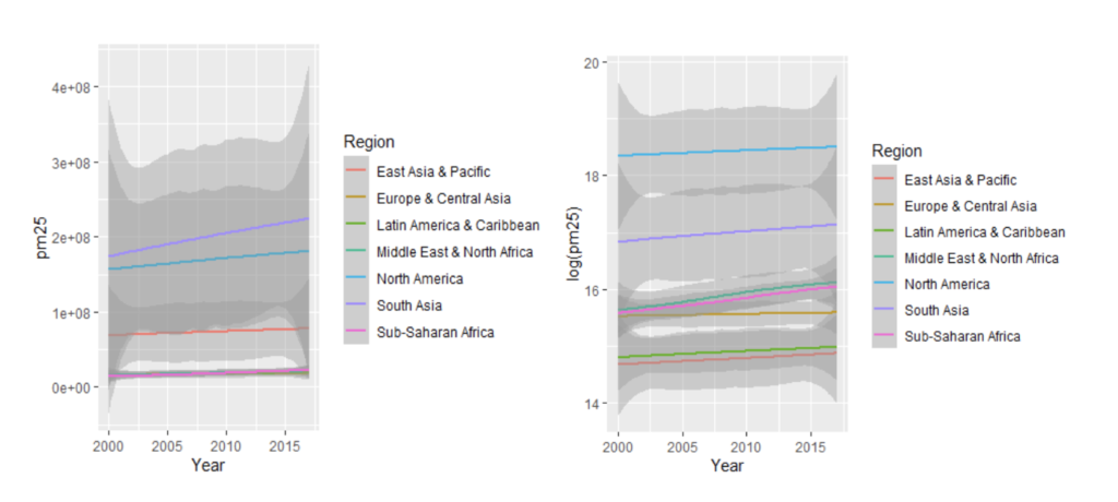
The same process has been done for different regions. As shown, the gray confidence interval is extremely wide separated, revealing how different countries vary even though they are in the same region. Meanwhile, the general trend is still increasing for almost all regions, inconsistent with the decrease within death rates. Also, what’s worth noticing here is that for North America, its increase is massive throughout the years, but it usually has relatively low death rates constantly. Throughout such observations, it can be concluded that perhaps there isn’t much correlation between PM2.5 and death rates of lower respiratory diseases.
4. Conclusion
After this data analysis, it finally comes to some conclusions about what influences the death rate of lower respiratory diseases.
Firstly, the death rate is strongly related to the economical situations of countries. In general, higher income countries usually have a lower death rate, while lower income countries have a higher death rate. Perhaps this is related to the level of health care in the countries. Obviously, for richer countries, they are able to provide better health care service to children, so that for children who have lower respiratory diseases, they can attain enough caring and get cured as soon as possible. For poorer countries, they don’t have enough money to provide such health care. In this pattern, the death rates can also represent how health care grows in 2000-2017. Throughout the years, even though all income groups have their death rate decreasing, lower income countries experience a more intensive decrease in death rate while higher income countries remain stagnant. Also, the decrease in middle income countries is significant under log scale. All of these reflect the link between income groups and death rates.
There are also some factors besides mere economical factors. As can be seen, under same category of income groups, still regions such as Sub-Saharan Africa or South Asia still experience a higher death rate. Therefore, perhaps there are some other factors besides income groups, such as cultural factors, or environmental factors. This still needs further exploration to decide what makes some regions have a higher or lower death rate under the same economical level.
Meanwhile, regarding to the assumption of the link between death rate and PM2.5 exposure, it appears that perhaps there aren’t much correlation between the two. While the PM2.5 exposure increases generally in 2000-2018, the death rates decrease intensively in any cases in those years. For the only consistence that low income countries have high PM2.5 exposure and high death rates, possibly it’s just a coincidence since the two matters can be explained in the perspective of income group separately. PM2.5 exposure is high because the country doesn’t have money to spend on clearing the air pollution. Death rates of lower respiratory diseases are high because the country doesn’t have enough money to provide children with good health care. Thus, PM2.5 and lower respiratory diseases death rates aren’t correlated.
But anyway, children health is often an essential topic in our society. As more countries become richer and our levels of health care improve, there will definitely be less children dying from lower respiratory diseases. The trend is pretty good in 2000-2017, and hopes the death rate will continue to decrease in the future, so more children can live more happily throughout their childhood without the pain of diseases and death.
5. Reference List
Mentor: Dr. Peter Kempthorne, Massachusetts Institute of Technology
- Brauer, M., et al. “PM2.5 Air Pollution, Mean Annual Exposure (Micrograms per Cubic Meter).” Data. The World Bank, 2017. https://data.worldbank.org/indicator/EN.ATM.PM25.MC.M3.
- “Number of Deaths in Children Aged <5, by Cause.” World Health Organization. World Health Organization. Accessed April 5, 2021. https://www.who.int/data/gho/data/indicators/indicator-details/GHO/number-of-deaths.
- “Population, Total.” Data. The World Bank. Accessed April 5, 2021. https://data.worldbank.org/indicator/SP.POP.TOTL.
- Serajuddin, Umar, and Nada Hamadeh. “New World Bank Country Classifications by Income Level: 2020-2021.” World Bank Blogs, July 1, 2020. https://blogs.worldbank.org/opendata/new-world-bank-country-classifications-income-level-2020-2021#:~:text=The%20World%20Bank%20assigns%20the,i.e.%202019%20in%20this%20case.
About the author

Yi Zou
Yi is a rising junior at the Starriver Bilingual School in Shanghai, China.
