

Author: Gitika Tirumishi Jada
CMR Institute Of Technology, Bangalore
September 1, 2021
1. Introduction
Data science is the study of data. It is a concept that unifies statistics, data analysis,
informatics and their related methods to understand the actual phenomena with data. Data
science in an interdisciplinary field focused on extracting large data sets (for example big
data) and applying the knowledge gained from that data to solve problems in a wide
range of application domains.
The methods used in processing the data seen in this paper are similar to that of signal
processing. Digital signal processing is used to process discrete time signals. Some of the
algorithms or techniques used in this are, Discrete time Fourier Transform (DFT), Fast
Fourier Transform (FFT), Finite Impulse Response (FIR), etc,. Along with these, we
make use of spectrograms to study the properties of these signals in different domains.
In this report, we will make use of LFP (local field potential) data, which is a form of
neural data. The data is read from the brain by a certain probe inserted in it. These
micro-needles are inserted in various parts of the brain, thus giving rise to many signals
recorded at different spatial locations. We want to discuss how to perform neural analysis
of these brain signals in both the frequency and time domain, therefore we introduce the
DFT and FFT techniques as well as the short time Fourier Transform STFT and the
spectrogram. Correlations of these LFP signals are introduced towards the end of the
report to investigate the relation among the signals and give an idea on how the brain
functions when subjected to certain tasks and which parts of it are functionally connected.
2. Time series
Time series is simply the collection of data over a period of time or at different points in
time. In most cases, a time series is a sequence taken at successive, equally spaced points.
Therefore it is called a sequence of discrete time data or a regular time series. In other
cases, if the time series is not taken over equally spaced points in time, it is called an
irregular time series. There can also be a change in the number of variables, resulting in a
multivariate time series.
This time series provides a source of additional information that can be analysed and used
in the prediction process. Time series analysis refers to the relationships between
different points in time within a single series.
Often while dealing with time series and data in the time domain, we use sampling as a
method to analyse the signal. In signal processing, when we are comparing and sampling
multiple signals, we come across an effect called aliasing. This is an effect that causes
different signals to be indistinguishable when sampled if they are sampled at different
rates. It can also refer to the distortion or artifact that results when a signal reconstructed
from its samples has not the same sample rate as the original signal.
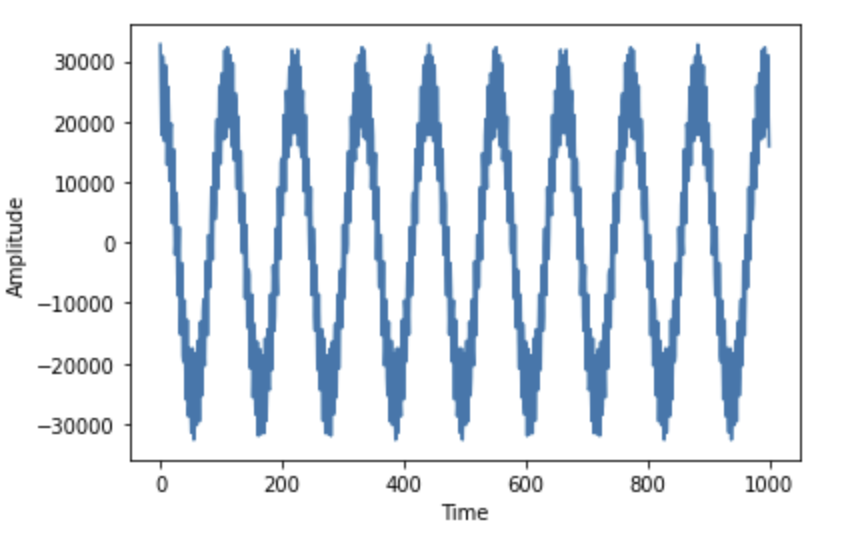
One such example of a time series is neural data signals. There are many types, the
Electro-encephalogram (EEG), the Local field potential (LPF), etc,. These are the data
taken from the brain signals. They are used in understanding how the brain works,
essentially which part of the brain has more activity when subjected to certain tasks. We
will be discussing more on the LFP in the later sections.
2.1 Time domain and frequency domain
The time domain is where signals are plotted with respect to time. Time domain analysis
is the analysis of this time series with reference to time. In the time domain, the signal’s
value is understood as a real number at various instances. A graph in the time domain
shows how the signals change with respect to time.
The frequency domain is where the signals are plotted with respect to frequency rather
than time. Now we can say, the frequency domain analysis is the analysis of a function or
a series in the frequency domain. A frequency domain displays how much of the signal
exists within a given frequency band concerning a range of frequencies.
2.2 Fourier Transform
A given function or signal can be converted between the time domain and the frequency domain by using certain mathematical operators called transforms. The most commonly used is the Fourier transform. What this does is, it converts the time function into an integral of simple waves like sines and cosines. The spectrum of the frequency components is the frequency domain representation of the signal. The Fourier transform of a signal x(t) can be represented as
The original signal can be reconstructed by applying an inverse Fourier transform. This can be written as-
2.3 Discrete Time Fourier Transform
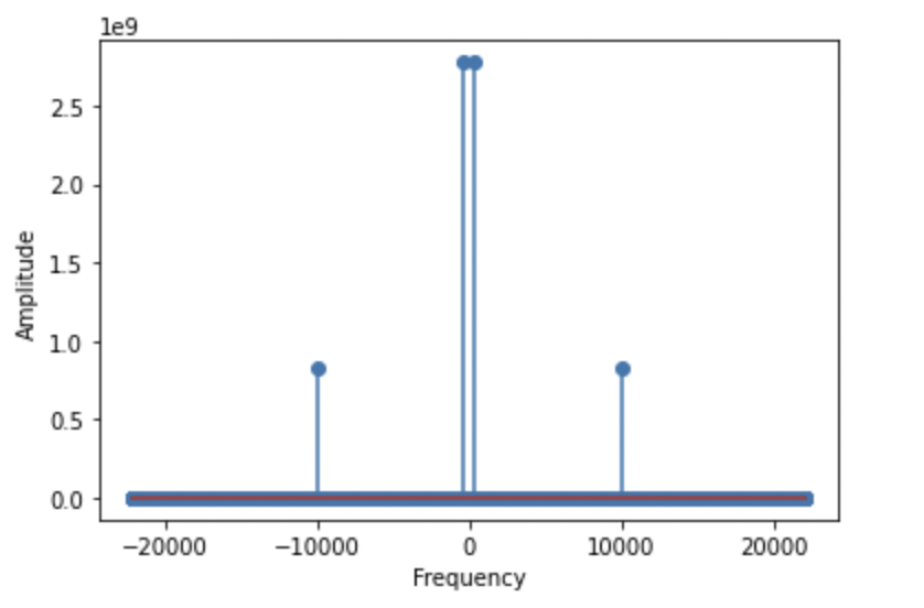
The Fourier transform deals with infinite number of samples, whereas the discrete time Fourier transform otherwise known as discrete Fourier transform (DFT) is a type of Fourier transform which converts finite number of equally spaced samples of a function in the time domain into a complex valued function of the same length in the frequency domain. Since experimentally we never have infinite time series acquisition, we always have to deal with finite time series and, therefore, we use the Discrete Fourier transform instead. The latter is expressed in formulas as
This creates a spectrum of all the frequency components present in the signal, similarly to the Fourier Transform. One of the many applications of the discrete Fourier transform is spectral analysis. When a sequence is represented as x{t} with samples uniformly spaced, the DFT can tell us about the frequency components of the signal or, in other words, the spectral content of the signal.
2.4 Power Spectral Density
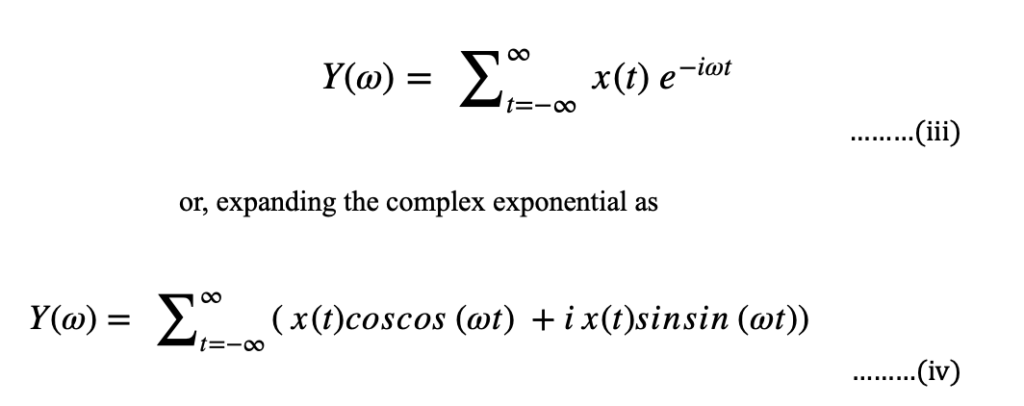
We can also derive a power spectrum from a time series. The power spectrum Sxx(ω) of a time series denoted by x(t) is the absolute value of the Frequency spectrum obtained by taking the DFT of the said time series.
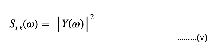
Where Y(ω) is the DFT of the signal x(t).
The spectral density obeys an important theorem, called the Parseval’s theorem which states that the integral of the spectral density equals the squared sum of the absolute value of the time signal, expressed in the following as-
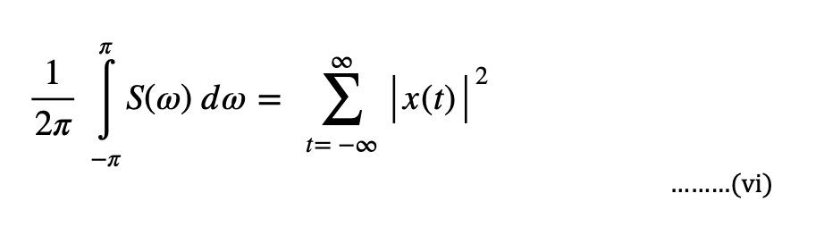
In the above equation, we can notice one of the important features of this theorem is that the integral of the components in the frequency domain is equal to the sum of all components in the time domain.
2.5 Short Time Fourier Transform
Another type of the Fourier transform is the short time Fourier transform (STFT). This transform is used to measure the sinusoidal frequency and phase content of a particular window in the signal. This involves dividing the signals into shorter time segments of equal length and then computing the DFT on each segment separately. This shows us the Fourier of each segment individually. Then we plot this to see the changes in the spectra. Taking an example for a signal x(t). The short time Fourier transform of this signal is essentially the product of this function and a window function which is non zero for a particular period of time.
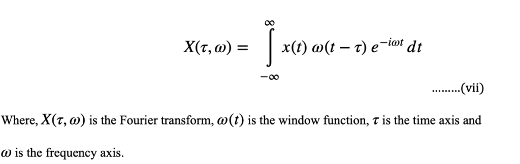
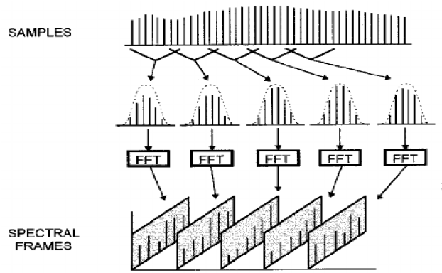
Fig 3: Several segments of the same signals are taken one after another and the DFT is computed for each of them
3. Spectrogram
The spectrogram is a 2-dimensional representation of the STFT where the time and frequency are expressed in the same plot on each of the two axes respectively. As we can see in Fig. 3, a shorter time segment of the original signal is considered. In the spectrogram, the squared absolute value of the power spectrum (i.e. the spectral energy density) of a segment is represented on the y axis and colored accordingly to its intensity. Consecutive DFTs are represented one after the other on the time axis vs frequency.
We consider the time signal shown in fig.4. There is an active signal between the time period 0 and 3 seconds, after which there is zero frequency for one second length. Then the active signal continues from the 4th second and continues till the end of the signal.
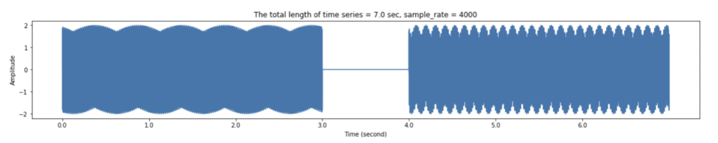
Fig 4: Time signal consisting of various frequencies.
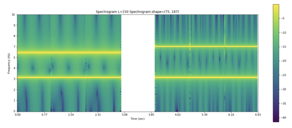
Fig.5 represents the spectrogram of the time signal shown above. As depicted, there are various frequencies from the zeroth second till the third second. There is a gap in the frequencies corresponding to the gap in the signal above. This spectrogram shows which frequency has what value at precisely which instant of time. The four distinct yellow lines represent the highest of frequencies occurring in the time signal. The colour bar helps the reader understand the magnitude of the various frequencies present in it.
3.1 Time-Frequency Uncertainty Principle
Coming to look at this spectrogram, we can wonder how one gets a precise value of the time or frequency component. There are several parameters we can adjust to achieve this precision. One of them being the size of the window we consider while taking the Fourier transform. If we have a narrow window, the temporal (time) precision will be high but there will be very few frequencies between 0 and Nyquist. As this window gets longer, there will be more frequencies so the frequency resolution will increase, but at the same time the temporal precision will decrease as the integration occurs over large periods of time. Therefore, there has to be a trade-off between the frequency resolution and the temporal resolution for us to attain a decent spectrogram.
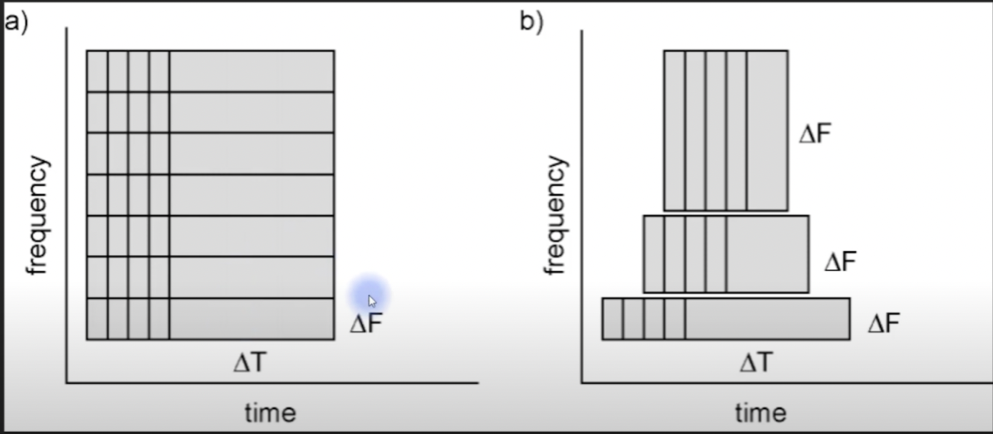
Fig 6: Time-Frequency Trade-off
Depending on the length of the window we consider, we can have two types of spectrograms – Narrowband spectrogram and a Wideband spectrogram.
3.2 Narrowband Spectrum
Narrowband spectrogram is where the window length is long. This means, there will be more points for computation of DFT. Therefore, more frequency resolution. The drawback here is that there is less time resolution as there are many points. As shown in the figure below, the frequency lines are very sharp, indicating exactly where these frequencies lie, but the time scale is not very clear.
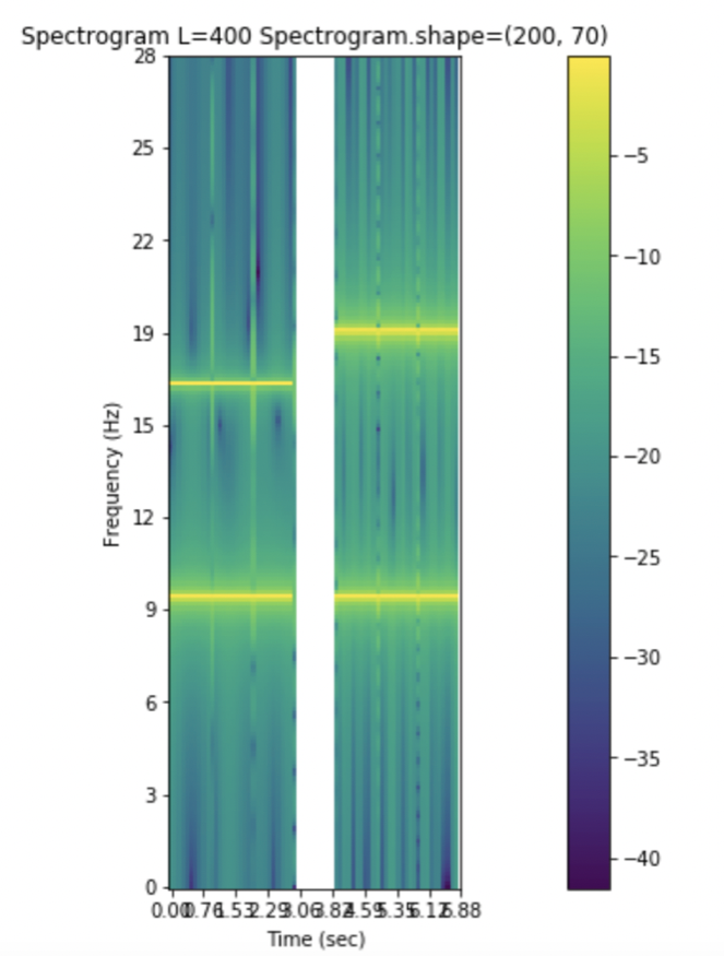
Fig 7: Narrowband spectrogram where the frequency resolution is very precise, but the time resolution is less accurate.
3.3 Wideband Spectrum
Wideband spectrum is where window length is short. This means, there are numerous time segments which account for precise location of transitions i.e., high time resolution. However, as the window is short, there are fewer DFT points which results in a poor frequency resolution. In Fig. 7, we can see that the timelines are very accurate but the frequency lines are vague and it is harder to identify the precise frequencies of the signal.
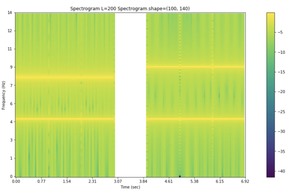
Fig 8: Wideband spectrogram where we can see exactly where the time events happen, but the frequency resolution is less accurate and frequency lines are blurry
3.4 Neural Data Analysis of Brain Signal
From this point forward, all the graphs and pictures have been derived from actual brain data. This data is the LFP signal from the brain of an animal when subjected to certain testing conditions.
3.5 Local Field Potential
The Local Field Potential is the electric potential recorded in the extracellular space around the neurons, typically using microneedles. They differ from electroencephalogram (EEG), which is recorded at the surface of the scalp with macro-electrodes.
When messages are transmitted from one neuron to another, there is a spike in potential known as action potential. This is what the LFP picks up. These are very refined signals as they are taken from such close proximity to the neurons, whereas in the case of the EEG, the signal must propagate through various media like the cranium, the cerebrospinal fluid, dura mater, muscle and skin.
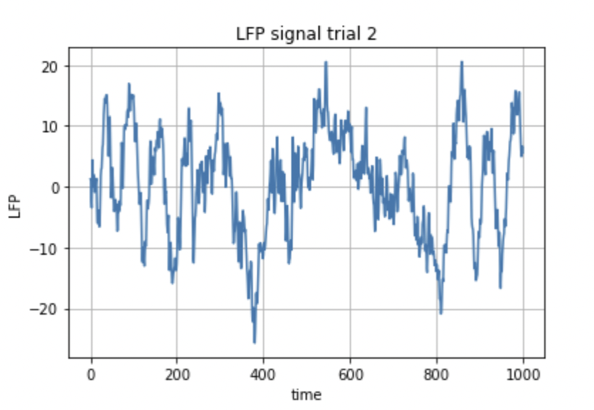
Fig.9: Neural data taken from the same electrode: two different trials of the same experiment
The LFP data shown in Fig.9 is just two trials conducted for a particular experiment, recorded by the same electrode. Each signal corresponds to the data collected by a single electrode. These probes were located at different locations, but the data was taken during the same period of time. The cumulative of all the signals is shown in fig. 10.
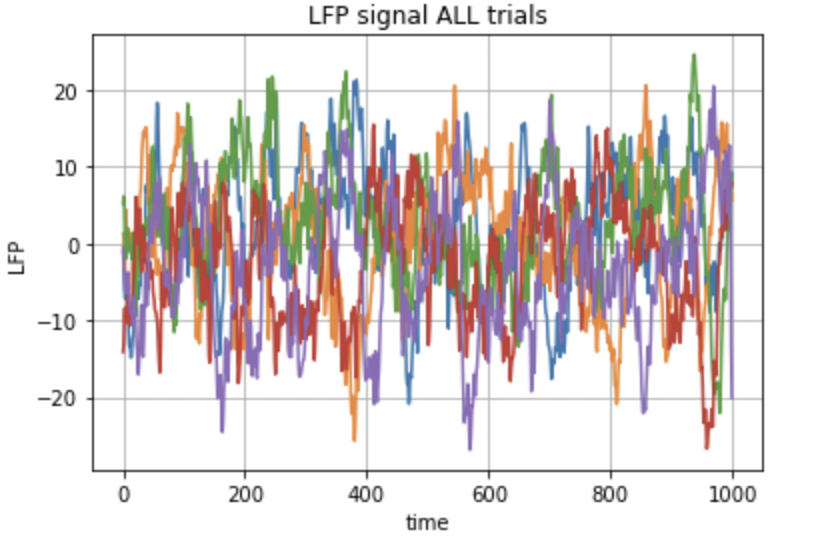
Fig.10: LFP data of five trails.
The mean of all these trials is then used for computation of the spectrogram. Fig.11 represents the mean of all the signals in the five trials.
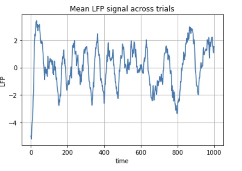
Fig 11: Graph showing the mean LPF of different trials of an experiment
Figure 11 shows the LFP that varies with time. As we can see, the y-axis has both negative and positive voltages. From the zeroth second, the signal shoots up from negative value of 4 to a positive value of 2, and then keeps on varying subsequently.
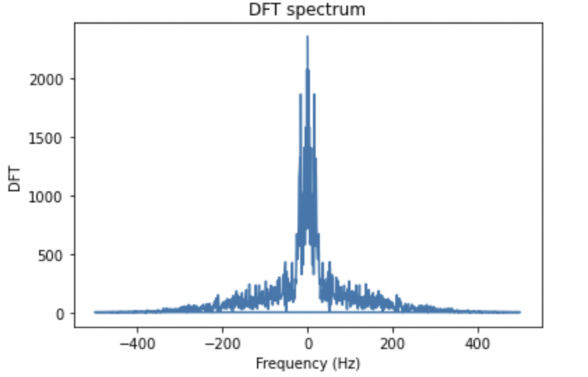
Fig 12: This figure shows the DFT of the LFP signal shown in Fig. 10
The graph in Fig.12 shows the DFT of the signal depicted in Fig.11. The graph of the positive frequencies looks like a mirror image of the negative frequencies. This is because the DFT has both positive and negative components which are similar in magnitude.
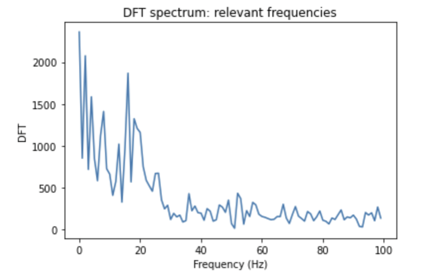
Fig 13: The expanded view of the DFT of Fig. 12 after eliminating the negative portion
The negative frequencies are eliminated and the positive ones are enhanced. As we can see, the graph is more readable now, the frequencies have distinguished values.
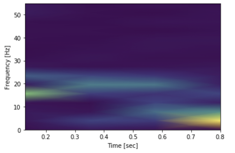
Fig.14: Spectrogram of the LFP data
The spectrogram of the given LFP data is depicted in Fig.14. The purple color indicates low frequencies whereas the blue, green and yellow colors indicate high frequencies.
3.6 Correlation Function
A useful tool for comparing two signals which are a function of time is the correlation function. It measures how similar two signals are. It is a function which is dependent on a certain amount of time shift. There are two types – autocorrelation and cross-correlation.
3.7 Cross-Correlation
Cross-correlation is defined as the correlation between a signal and a time shifted version of another signal. This is also known as the sliding dot product or sliding inner product. We can consider two signals x(t) and y(t) which are functions of time. The cross-correlation function can be written as-
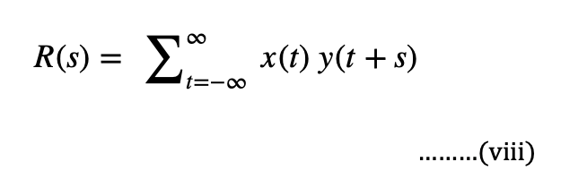
Where s is the shift in time.
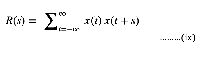
3.8 Autocorrelation
Autocorrelation, also known as serial correlation, is the correlation of a signal with a delayed version of itself. In other words, it is the observations of the time lag in the signal. In signal analysis we can use this to analyze functions or series of values. Considering the same example as above, we can write the autocorrelation functions as-
3.9 Covariance
Covariance is defined as the measure of correlation. In other words, covariance gives an exact number to the similarities between two variables. It is represented by eqn (x).
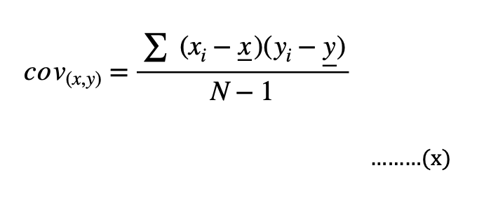
Where, xi and yi are data values of x and y respectively, x and y are mean values and N is the number of data values.
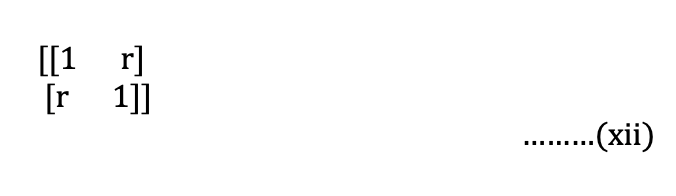
3.10 Pearson Correlation
Another method to calculate correlation is to find the Pearson coefficient. It is defined as the measure of linear correlation between two sets of data. As with covariance itself, the measure can only reflect a linear correlation of variables, and ignores many other types of relationship or correlation.
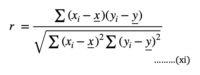
Eqn.(xi) represents the formula to calculate the Pearson coefficient. From this we can obtain the correlation matrix as follows-
3.11 Correlation Of Neural Data
We consider two signals of the LFP data from two different electrodes, to calculate the correlation. The two signals are represented by two distinct colors. We can see how each of these signals changes with time, and how similar they are to each other.
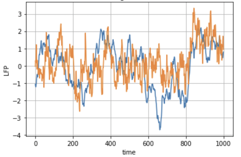
Fig 15: LFP data taken into consideration for calculation of correlation
We now calculate the correlation among the LFP signals acquired in 5 different electrodes at different brain locations and obtain the correlation matrix represented in Fig. 16. For simplicity, we restricted ourselves to only 5 electrodes for the computation of the correlation matrix.
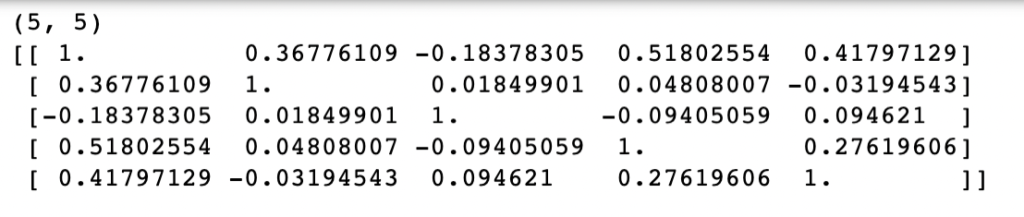
Fig.16: Correlation matrix for LFP data
Note that the diagonal elements of the matrix are all ‘1’, since they are the correlation of a column with itself. Another point of observation is that this matrix is also symmetric as shown in Pearson correlation.
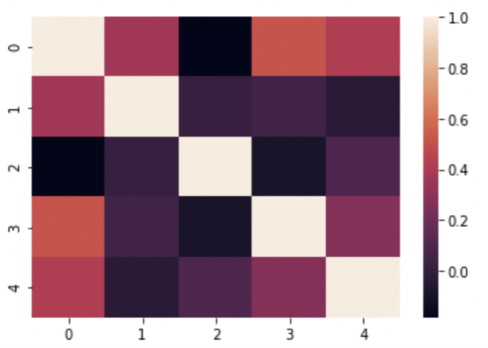
Fig.17: Correlation plot for LFP data corresponding to 5 data points
Fig.17 shows the corresponding plot for the correlation matrix in Fig.16. The diagonal elements of the plot are shaded white: indicating high correlation, which is true because all the diagonal elements are one. On the contrary, the elements shaded as black have zero correlation. Taking the heat map as reference, we can locate which part of the signal has high correlation and which part does not.
Here below, we plot two LFP signals vs time that have small correlation in Fig. 17, these are the electrodes 1 and 2 which show low correlation in Fig. 17. This way we can conclude to what extent these signals are similar.
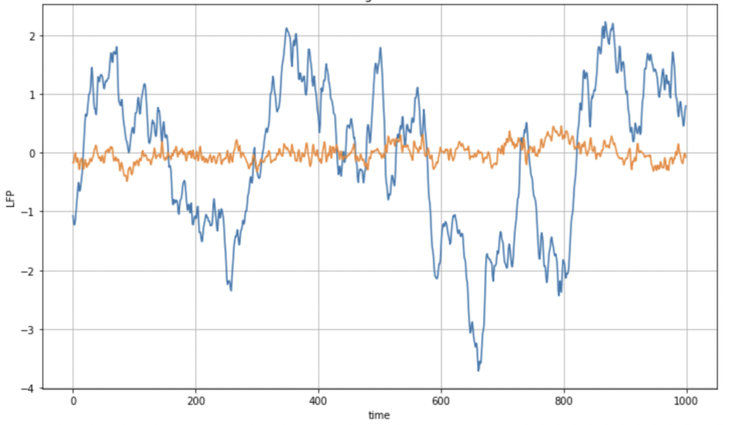
Fig.18: LFP data from electrode 1 and electrode 2
We can observe here in fig.18, these signals are not very similar: the correlation indeed is very small as one can observe from the correlation matrix for these electrodes.
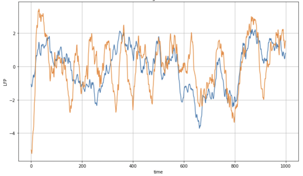
Fig.19: LFP data from electrode 1 and 3
Fig.19 represents data which is much more similar than the data from Fig.18, these are electrodes 1 and 3. The peaks and dips of the signal from trail 1 are consistent with that of trial 2. Taking these observations into consideration, we can propose that the parts of the brain from where this data was taken, are connected or work in coordination when subjected to certain tasks. These two electrodes have, indeed, higher correlation as one can observe from the correlation matrix in Fig. 17.
4. Coding
All the graphs and plots in this paper have been coded using python. The codes for these respective figures can be found in the link given below-
https://github.com/giti21/Neural-Data-Analysis
5. References
Mentor: Dr. Gino Del Ferraro, NYU
- Time Series – Stoica, P and Moses, R. (2004). Spectral Analysis of signals. Prentice Hall. Wikipedia
- Frequency vs. time Domain – Wikipedia
- Fourier Transform – Wikipedia STFT
- Power Spectral density – Stoica, P and Moses, R. (2004). Spectral Analysis of signals. Prentice Hall.
- Spectrogram – Wikipedia Spectrogram code
- Correlation – Wikipedia, Tutorial Covariance Pearson Correlation
- Local Field Potential – LFP
About the author
Gitika Tirumishi Jada
Gitika is a Senior in college where she studies Electronics. She recently picked up interest in the field of Data science and its applications in the medical field.