

Author: Leison Gao
Los Gatos High School
February 6, 2021
1 Introduction
1.1 Overview of COVID-19
COVID-19 was first found in Wuhan, China. COVID-19 was first thought to be pneumonia, but was later discovered to be a new strain of coronavirus. The disease was a respiratory virus that could be spread through droplets in the air. As a result many countries created guidelines to protect people from spreading the virus. One of the most impactful guidelines put into place were shelter in place orders. Businesses closed down and economies suffered greatly. At one point, oil had negative value due to lack of consumption.
The virus spread from China to Europe and other countries such as the US. Mainly due to the high amount of travel between other countries and China. In February 2020, the first COVID-19 case was detected in the US. Some countries, like Vietnam handled the virus better than others by imposing strict quarantine and stay at home orders. On the contrary, some countries such as Italy suffered greatly due to lack of preparation and other factors. The world surpassed 1 million COVID-19 deaths in late September 2020 and the cases continue to climb into 2021.
COVID-19 is a disease that has had an unprecedented effect on the world. The most similar pandemic happened over a century ago with the Spanish Flu. The disease has taken its toll on every single person with people losing their loved ones, others suffering financially, and many lifestyles changed to reduce the spread of the virus.
Unfortunately COVID-19 continues to infect more people and there seems to be no peak for the cases yet. New mutations of the virus are being discovered which threaten more people and more lives. At the same time, governments are sponsoring vaccine development and leading healthcare experts are battling against the virus to develop and distribute a vaccine, and possibly a cure.
1.2 Goals of the paper
In this research paper, data of cases over time for separate countries will be analyzed. The goal of the analysis is to discover similarities between countries and general trends of the spread of the disease. From these trends, people can then understand what caused the different rates of spread and how governments can take better action and build on the successes of other governments to mitigate the spread of future viruses.
2 Methodology
2.1 Data
The data used in this study was taken online from data pulled from the John Hopkins University Center for Systems Science and Engineering. The dataset is about the 2019 Coronavirus pandemic, also known as COVID-19. The dataset contains data dating back to the beginning of the pandemic in late January 2020 and continues to be updated nearly daily at the time of this research paper’s publication, mid February 2021. Data from 191 countries is collected as well as some that include specific provinces within the countries. The data is grouped using date and country and has the total number of confirmed cases, deaths, and recoveries for each date.
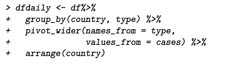
Changes to the data were needed in order to effectively work on the data and fully understand what the data presented. In order to accomplish this, several new datasets were created using the data collected. Firstly, the data was organized so that the number of confirmed cases, deaths, and recoveries could all be listed in one row, or observation. This presented data that had simple the cases that occurred on a certain date. This created the dataset ”dfdaily”.
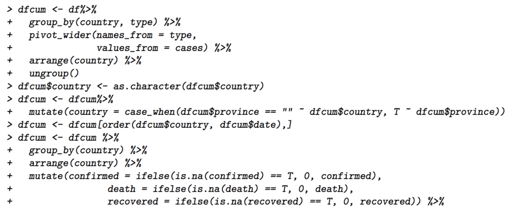
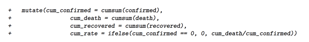
In addition, cumulative case counts were also needed to analyze the data. Contrary to the ”dfdaily” dataset, the ”dfcum” dataset has observations that represent the total case count that the country had on the specific date.
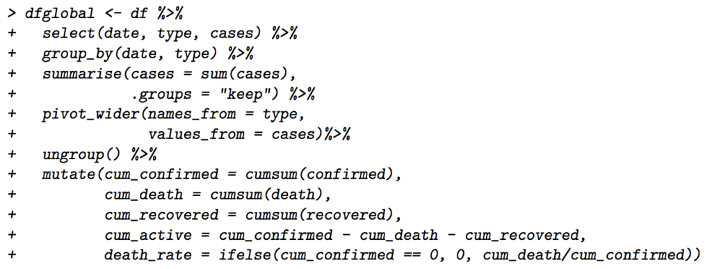
Moreover, a dataset representing the total global cases by date is also helpful in the analysis. This dataset would require the countries to be dropped and would have the confirmed cases, deaths, and recoveries for the whole world by date, as well as the cumulative counts of each of them. This dataset would be named ”dfglobal”.
Finally, a dataset that represented the total cases was created to understand what the countries’ confirmed cases, deaths, and recoveries were in total. This dataset, ”dfrate”, essentially is the observations in ”dfcum” that have the latest date value. Also, a death rate was calculated for each country based on the case count.
3 Data Analysis
3.1 Global Analysis
To begin, take the data for all the countries collectively and see the world’s cumulative data. Some of these would be cumulative confirmed cases, deaths, recoveries over time. Instead we can also look at the cases from each day or the cumulative death rate for each day.
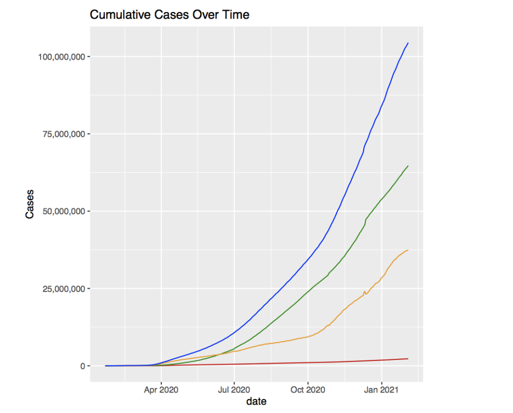
The graph above shows the total cumulative cases over time. The red line represents the deaths, the orange line, active cases, the green line, recoveries, and the blue line, total confirmed cases.
It appears that the confirmed cases, deaths, and recoveries all seem to grow relative to each other. There appears to be a small growth that gradually grows to become exponential in all the graphs. Around April 2020 seems to be when the cases begin to grow rapidly which is around 4-5 months after the discovery of the virus. In addition, the active cases first begin to be larger than the recoveries in the time period following April. However this seems expected since the average time of recovery from the virus is around 2-6 weeks depending on the severity of the case.
Something that is concerning is that there still seems to be no peak of the curve. This is worrying because there always have been reminders about ”flattening the curve”, yet the peak has not arrived yet. The data shows that the cases will continue to grow, possibly even more exponentially into the future, with no real sign of it flattening out and beginning to decline going into 2021.
The virus was predicted to get better during the summer months in the US, however the data seems to contradict that statement. Around July, the confirmed cases seem to take a bend upwards and grow more rapidly than before. The cause might be due to people wanting to enjoy a summer vacation despite the conditions of the virus.
Next, looking at the global death rate alongside global deaths over time might reveal some more information about the virus.
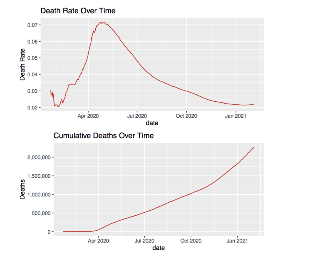
The sudden rise of death rate around April seems unexpected. However the total confirmed cases also began to grow rapidly around April as seen in the last graph. The reason for the spike in death rate is most likely due to the overflow of COVID-19 patients in hospitals. Without enough medical supplies or facilities, there would have been many people with the disease not getting adequate care. Because of this, the amount of deaths compared to the number of cases would have gone up, which increases the death rate.
The rise in death rate is also seen in the cumulative deaths over time. The deaths begin to grow more rapidly after April which mirrors the behavior of the death rate graph to a certain extent. After May the death rate seems to hit its peak around 7% and begins to slowly drop down to the predicted 2-3% death rate. This is probably due to the increased political activity of some nations to further understand the virus and develop better treatment patterns. In addition, many more medical facilities were created which would have helped with the overcrowding in the hospitals.
Even though the death rate has dropped to reach the 2-3% predicted death rate, the deaths continue to grow and have begun to grow at a larger rate around November 2020. This is due to the increasing number of confirmed case. Even if the death rate sits at something as low at 2%, the exponentially increasing number of confirmed cases will still continue to have an impact on the number of deaths.
As seen before, there have been changes in the rate that the cases grow. These are seen in the graphs where the slope of the line seems to change. For example, the confirmed cases seems to have a change in rate beginning in April, a change before June, and one later in October. As stated before, the change in rate in April was most likely due to the rapid spread of the virus from the small number of people that were not contained. Later in June, the change in rate is likely due to people wanting to enjoy a summer vacation. One change in rate that has not been touched on is the change in October.
The confirmed case graph changes to become a much steeper line than before and the active cases seem to mimic its activity, but with a more noticeable increase in rate. Back during the early months of the virus, news suggested that the virus would tone down and spread would be smaller in the summer. Ironically, this seems to be wrong as the rate increases when heading into the summer months. However, the main point that the news stressed was that the virus could rebound during the winter due to colder temperature. This seems to be the explanation for the increase in rate for confirmed COVID-19 cases.
Moving on, the daily case count can also be analyzed to have a deeper understand of the data. We begin by looking at the new confirmed cases for each date.
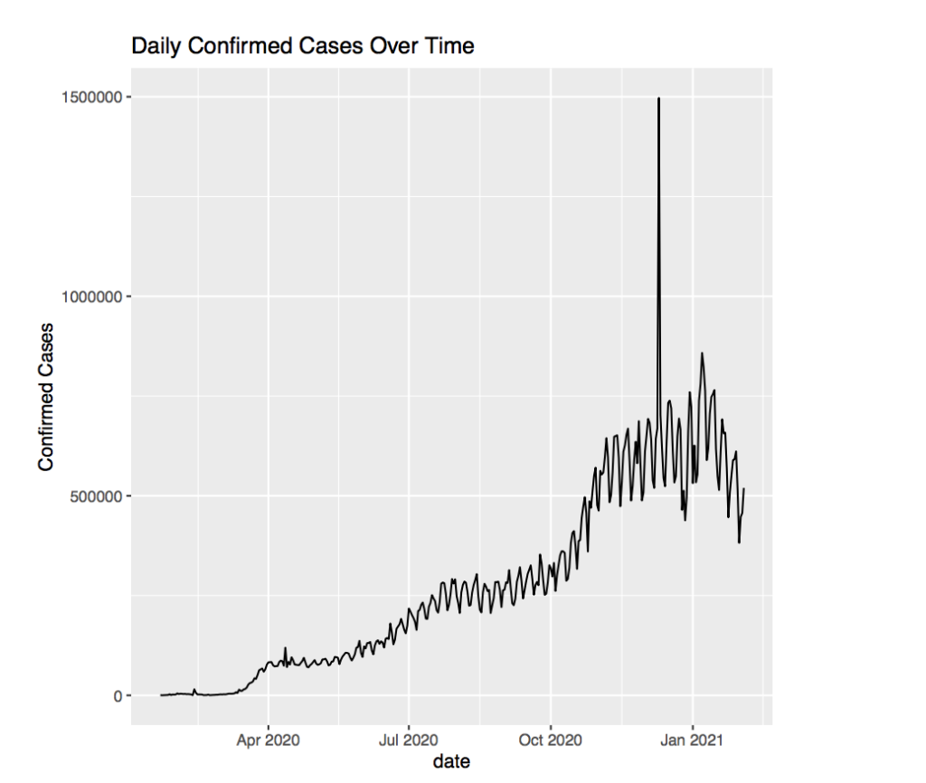
The graph for this looks wild with the confirmed cases jumping up and down over and over again. However this is due to some countries such as Botswana, only reporting cases every couple of days. Other countries also have widely varying values over a couple of days. This might be due to the speed of communication between certain parts of the country or other outside factors preventing every medical center from reporting data on a daily basis.
What is worrying, is the massive spike before January that does not fit the trend whatsoever. More specifically, this is on December 10, 2020. Upon closer inspection, it appears to be an observation of Turkey that records over 800,000 confirmed cases on that day. This completely contrasts the other data in adjacent dates that hover around 30,000. Furthermore, there appears to be another observation from Turkey a little later that reports over 1,000,000 recoveries in one day. This is absurd, albeit good, if the data is correct. However ignoring data points like this will help make our graph clearer.
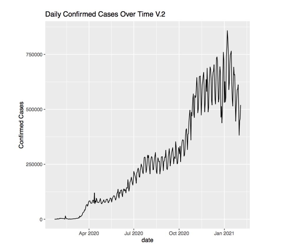
In this graph, the line seems to be taking ”steps” where there are steeper portions and flatter portions. For example, the graph is flat up until a little before April. Before April, the graph takes a ”step” as the number of daily confirmed cases increases a lot. However afterwards, the graph become relatively flat. Then before July, the graph once again takes a step. This time, the step appears to be more gradual and plateaus around 250,000 cases daily. Then there appears to be a massive step after October which brings the average confirmed cases daily to over 500,000. Notice that the steps occur at nearly the same time frame as the increases in rates for cumulative cases. This suggests that the steps in the daily confirmed cases cause the change in rate for the cumulative cases.
Furthermore, it appears that the oscillation in the graph appears very small when starting out, but grows very large towards the beginning of 2021 where it has a change in over 125,000 every time it jumps from low to high. This is most likely just a result of the increasing number of cases. Since cases increase, there will be a larger number of cases that graph changes by when adding the data that is not updated daily.
3.2 Grouping countries based on similar factors
Grouping countries together can uncover some trends that cannot be seen when looking at all the data cumulatively. First grouping the top 5 countries with the highest case count.
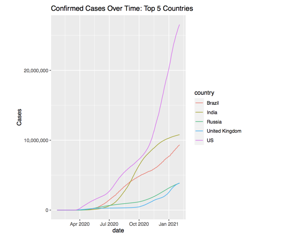
There appears to be a very large difference between the country with the highest cases and the other 4 countries. The gap is so large, that it seems like the total cases of all the other 4 countries could sum to the amount of cases the top country has. Unfortunately, it is the US that has the greatest number of confirmed COVID-19 cases. The graph suggests that it is greater than 25 million as of February 2021.
The lines themselves also tell a story. For example, the line representing the US is the steepest and the steepness seems to begin after October. This lines up with the global data. However it is hard to tell if the US is following the global trend, or if it is creating the global trend.
Taking a look at the second highest case country, India, we find a much more mellow graph. The growth of cases in India around August 2020 seem to have approached a growth similar to the US’s in late 2020. However, the growth seems to have reduced and a peak of the curve seems to be emerging. The rest of the countries seem to still be growing in case numbers without having reached their peaks.
Another fact that is not promising for the US is the ratio of cases to total population compared to other countries. The population of the US is about 330 million and the total cases is above 25 million. This means that around 13% of the total population has been infected by the virus. Compare this to India which is considered to be worse off medically and economically in some parts than the US. India’s population is over 1 billion people, yet their total confirmed cases is just above 10 million. This is about 1% of their population.
The US, with nearly 3 times the land mass of India has over 10 times the percentage of their population infected with COVID-19. India being a very crowded and even poor country, seems to have done much better than the US when facing this pandemic. The question become why this is the case.
Perhaps the data is rather inaccurate compared to the US because of lack of testing centers in the India compared to the US. Instead, we might look towards a more ”trustworthy” nation such as the UK and compare it to the US. The population of the UK is around 67 million and the total confirmed cases is about 4 million. This means about 17% of the population has been infected by COVID-19.
The idea that the US has been doing terrible with COVID seems to be rather weak. Other countries such as the UK seem to be doing about the same, or even a little worse.
Looking at the current active cases can reveal some more information.
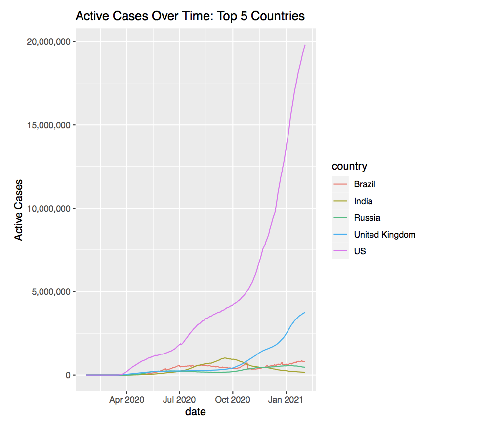
It appears that the US has nearly 20 million active cases as of February 2021. This translates to about 4/5 of the total cases being active cases. Similarly, the UK has around 3.5 million active cases. Comparing this to the total cases the UK has results in around 7/8 of the total cases being active. This is by no means good, but it stands out very much compared to other countries such as India, who seem to have hit their peak cases before October 2020.
The difference in Active case count suggest that the results of the other countries could possibly be inaccurate from reality due to logistical problems or other factors tying into the collection of the data.
3.3 Comparing cases between continents
When dividing the data into groups that share similar factors, the idea of global region comes to mind. A general grouping based on the latitude and longitude values in the data help group the countries by continent.
To get a general idea of the data, we can try plotting the total confirmed cases over time for a specific continent, in this case, Europe.
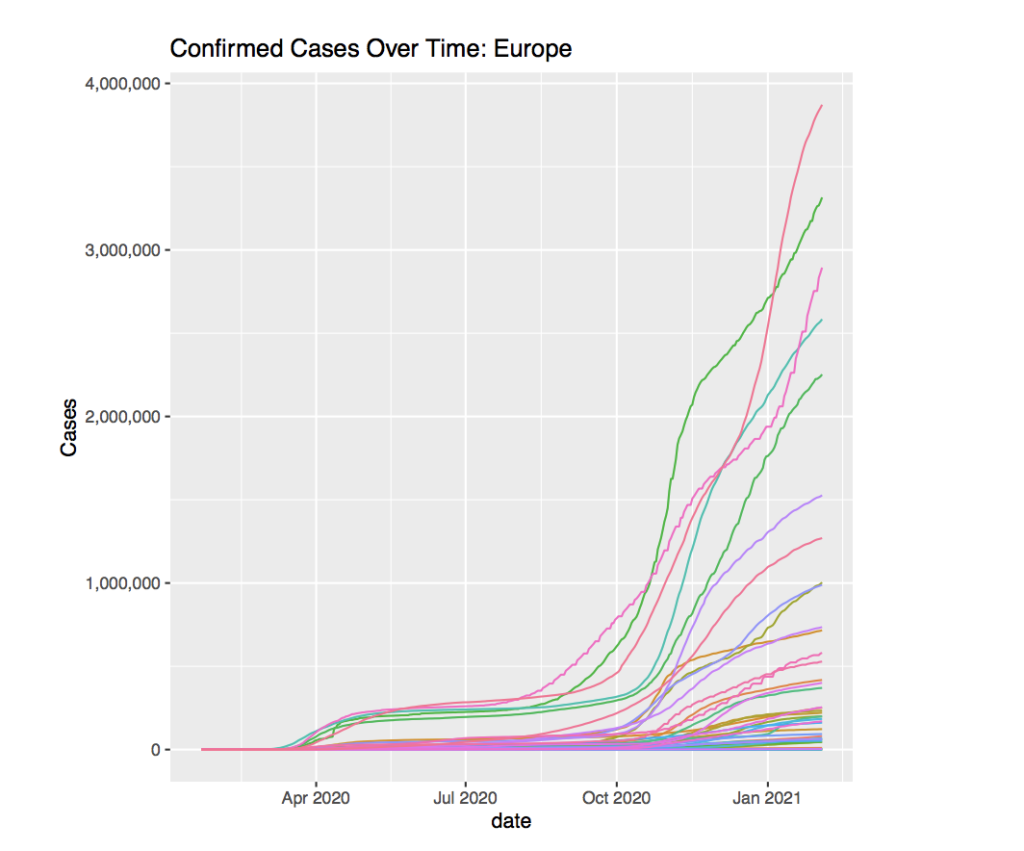
Starting around April 2020, a split appears in the graph. A few countries begin to experience a sizable increase in total cases, while the rest of the countries seem to stay on a slower rate of increase. One could infer that the countries that have a greater increase were more connected with the rest of the world and therefore the cases increased as the whole world began to get infected.
The graph seems to stay rather constant until October 2020 which suggests that the governments were able to contain the virus and quarantine those who were infected. Once Autumn hits, the cases begin to grow rapidly for those who felt a larger initial increase, but the more ”dormant” countries still experience some change in the growth rate.
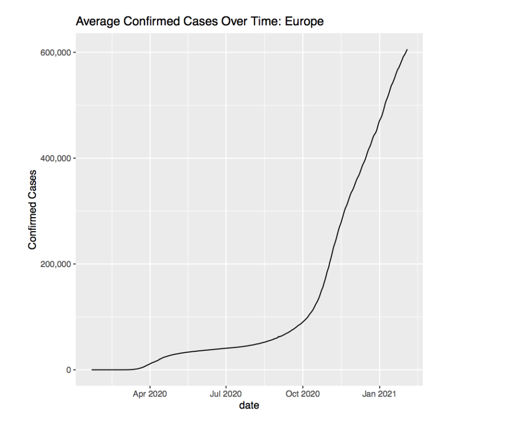
The average cases over time in Europe seem to reflect the graph of all the countries rather well. The increase in cases around April 2020 seems to have the same curve and the increase in October matches the previous graph rather well.
Taking a look at Asia might reveal some similarities between the continents.
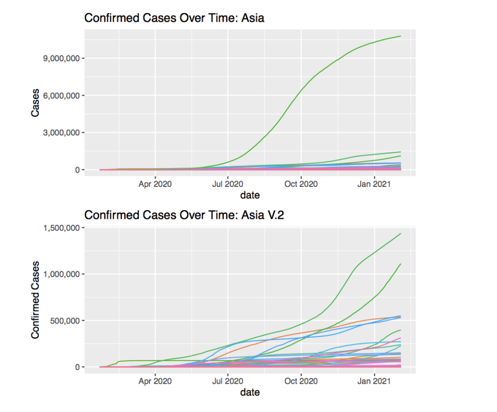
First of all, the line that skews most of the graph is India. In order to have a better understanding of the Asian countries, filtering out India is a must.
The country that has cases way before April 2020 is China, the country where the virus originated. The cases seem to grow very rapidly at the start, but they seem to have stabilized the condition very quickly. This may be due to the power of the Chinese government that keeps people quarantined and safe even if people try to resist. In other places such as the US, the government has been more lenient with the COVID-19 policies which have cause people to actively spread the virus on their own.
Interestingly, the cases in Asia seem to begin a month or two after April 2020. This is contrasting the growth in cases that happened around early April 2020 in Europe. The cases also do not seem to grow as drastically when transitioning into October 2020 in Asia as they had in Europe.
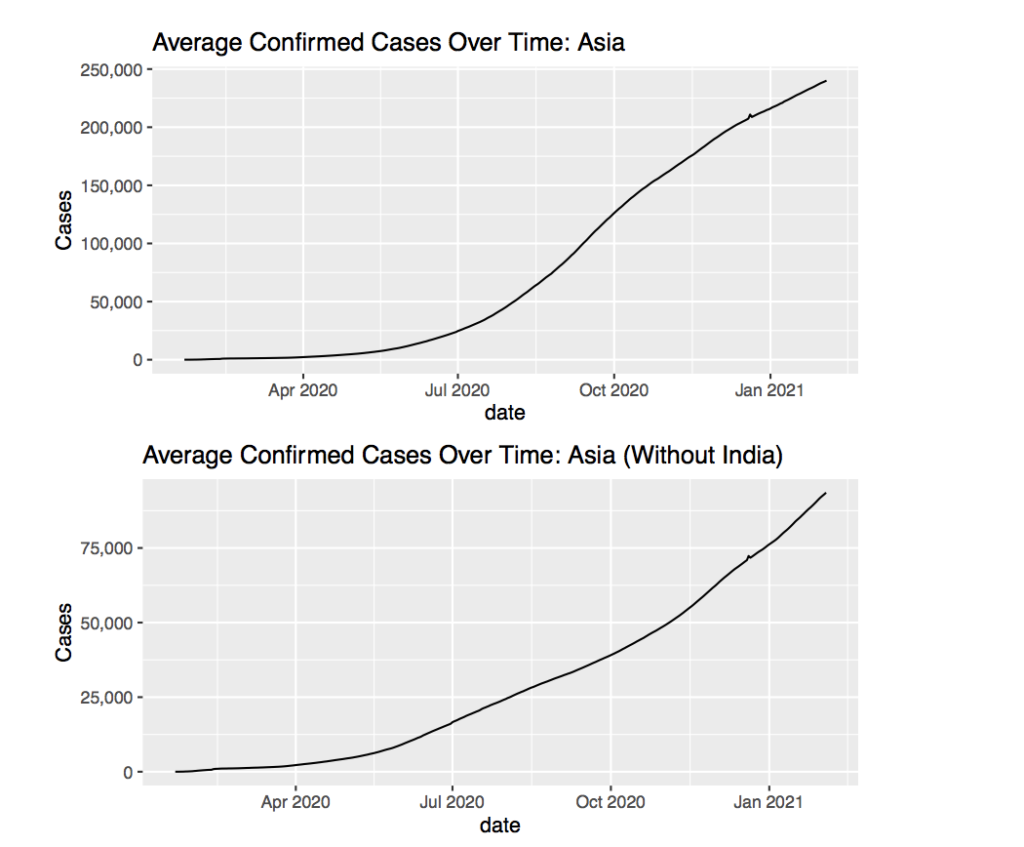
Including the country India almost quadruples the average for the continent so removing India helps in more accurately representing the rest of the countries. The most noticeable part of the graph is how linear is compared to the average for Europe and even the average with India. This suggests steady growth over time for the cases in Asia. Perhaps not enough government action has been taken, but the population, or the population density, or some other factor is keeping the rate of increase low. However if the graph was linear like this and very steep such as the graph towards the end of 2020 for Europe, a problem would appear. This begins to shine light on how such factors such as government support or population density can affect how the virus spread.
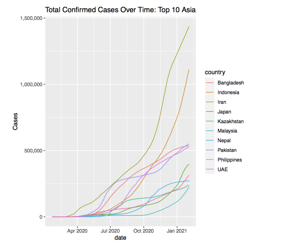
If we isolate the countries with the most cases, we get this graph, once again removing India. It appears that Indonesia and Iran have the most confirmed cases. The rest of the countries seem to be clustered around two points as of January 2021. One group of countries sits around 500,000 cases, where the other group seems to be around 250,000 cases.
Moving onto Africa, the graph seems very similar to the one of Asia with a couple outliers.
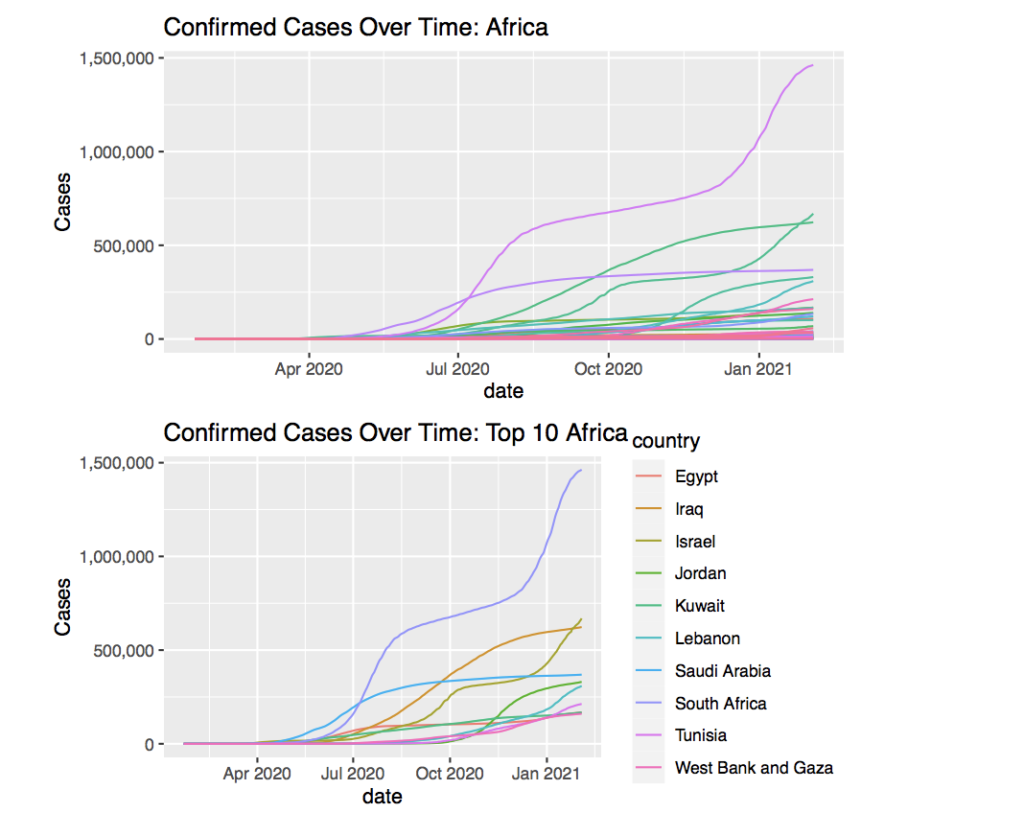
The graph’s trends seem to align with what has been found before, but the timing of the growth seems to be shifted later. The first initial growth seems to begin around mid-May 2020 compared to early April 2020 in more ”connected” countries. For most of the countries, the growth seems to be very slow and gradual, but for some, the growth changes or grows at a very rapid rate.
Once isolating the countries with the most cases, one country that stands out. South Africa appears to have the ”steps” pattern in its graph where all the other countries are not as similar to the ”steps” pattern. In addition, it has around double the cases of the other countries. This seems strange since South Africa seems to be similar to the other countries regarding economy and other factors. The most probable reason for South Africa’s case count would be its business and people going to South Africa for business compared to other countries whose economy runs on other factors. In addition, there is always the possibility of inaccurate data collection in African countries and South Africa might be the country that has collected COVID-19 data the best. Therefore South Africa would have higher total case counts.
4 Statement of Limitations
4.1 Alternatives
Other ways to approach the data analysis would be to focus on specific countries individually then compare them after each country was analyzed. This would provide a much more thorough analysis of the data and help understand how each country went through the pandemic.
In addition, this study focused more on the total confirmed cases over time and how the values for that changed. The data used also allowed more analysis into total deaths, recoveries, or death rates that were not focused on in this paper. When analyzing death rates and deaths, one could understand more about the health care systems and compare how well COVID-19 was treated, compared to how it spread.
4.2 Weaknesses
A large weakness came with the data itself. Governments might not be able to collect all the data accurately. Even though the data was collected from a trusted source, John Hopkins University, the data that the countries released may have been flawed. One instance of this could be seen in the mistake in the data for Turkey with over 1 million recoveries in one day. Governments either have falsified data or simply cannot measure data regularly enough. This could be seen in the daily cases graph which became jagged.
The thorough analysis of the data going by every country would be very weak to the inconsistent data. Many countries have inconsistent data and thoroughly analyzing them all would be inefficient and ineffective. Perhaps a blend of thorough analysis on specific countries and a global approach would have been the best way to work with the data. A next step would be the analysis of death rates and deaths for countries would bring very valuable insight to the study. However the death rates and deaths more shine light on the treatment and effectiveness of the treatment of COVID-19 rather than the spread itself which was the main focus of this research paper.
4.3 Challenges
Working with the dataset was rather challenging. The data itself came with some flaws such as incomplete data, or outliers that skewed the data. This was difficult to work through and questioned the validity of the rest of the data. Some outliers could exists for individual countries, but would not be seen without checking the graph of each country independently.
On a more personal scale, fully understanding and working with the data was new and posed many challenges of getting the code itself to run.
5 Conclusion
5.1 Discoveries
There seems to be very distinct trends in the graph across the data. For example the trend in the early growth of cases in April. Some countries had this portion of the graph shifted earlier or later. It is interesting to understand that different countries get infected at different times due to the kinds of connections the country has with the world. Even though the growth started at different times, the general trend of sharp growth followed by a plateau in the cases shows that the virus always seems to take the same course when spreading.
In addition, the second ”wave” of COVID-19 also appeared dominant in countries that were considered first-world or better off than others. Surprisingly, they were the ones that experienced the second ”wave” and the third world countries did not experience this second ”wave” of cases.
The difference between cases for countries and general trends seems to stay consistent throughout the data. This suggests that the virus still has similar impacts regardless of how developed a country is. Perhaps it does not matter how developed or wealthy the country is, but rather the effectiveness of the government and people to combat the virus together.
Another thing that stands out is how some more authoritarian governments handled the virus better than more democratic governments. Sometimes governments have to take action to do what is better for the people, even if the people themselves do not want to. The freedom that comes with democratic governments has its downsides that allow the people to do what they wish, sometimes at the expense of others. Governments sometimes need to be able to enforce their laws to protect the lives of their people, but it also needs to come with balance to prevent the exploitation of the people.
5.2 Significance
Many trends have popped up when analyzing the data, some of the most prominent ones are the growth starting around April 2020, and the increase in rate around October 2020 when moving into Autumn. The increase in growth in April was most likely due to the spread of the virus to all the other countries through business and travel. Even though the virus was discovered in late December 2019, the growth still hit many countries almost 6 months later.
The question then becomes when is a good time to quarantine society and prevent the spread of the virus? Because many countries would not want to shut down their economy and let other countries get an upper hand in trade and other things. Perhaps it is the selfish nature of humans to keep airlines open and allow the virus to spread freely, only taking action when people lose their lives. The increase in rate around April is most likely due to the lack of government action to prevent the spread of the virus. To prevent this in the future, governments should take action quickly and effectively.
The growth starting later in October can be explained with the colder weathers which create a better environment for the virus to thrive. Some of the increase in cases could also be attributed to people relaxing their stay-at-home procedures or others becoming desperate to support themselves financially.
Addressing the first point, people will become bored and look to find relief from the dull quarantine. This however, should be prevented because it seems to be the least meaningful way to cause the spread of the virus. Not out of necessity, but out of boredom or other feelings, people will risk their lives and the lives of others to help themselves. Government action may have a role in this. Where you see more powerful governments, people are forced to stay at home or be arrested. Whether or not this goes against human right, it certainly is effective. In countries such as China, measures were put into place to limit the amount of people going outside and such. It seems to be effective because, even though China was the origin of the virus, they have limited the spread and have almost returned to normal life by 2021.
The issue of financial aid and other factors that force people to go outside and spread the disease can also be looked at. In the US, every person wants to get their money from others to survive, otherwise they themselves cannot afford to quarantine at home. These actions can be seen in landlords evicting people because they cannot pay their rent. The evictions benefit no one and only further the spread of the virus. Government action and financial aid can help, but that is beyond the scope of the research paper. The economics behind the situation cannot be analyzed in this paper.
5.3 Contributions
Thank you to Dr. Peter Kempthorne for being my mentor for this project. This project was actually my first real project in Statistics and using the Language R. I came into this project with some beginner knowledge in other coding languages, but none of them I had used in the way I used R. However after some perseverance, I learned how to generally work with R functions and create data that is useful.
Outside of R, I also learned a lot about statistical thinking in general. While working on this project under a mentor, I was able to understand more of the thought process of how to represent data well, and even new ways to use the data to predict things in the future. Unfortunately, I was not able to incorporate those aspects of my learning into this research paper.
5.4 Citations
Soetewey, Antoine. “Top 5 R Resources on COVID-19 Coronavirus.” Medium, Towards Data Science, 10 Jan. 2021, towardsdatascience.com/top-5-r-resources-on-covid-19-coronavirus-1d4c8df6d85f.
Krispin, Rami. “RamiKrispin/coronavirus_dashboard.” GitHub, 2020, github.com/RamiKrispin/coronavirus_dashboard.
About the author
Leison Gao
Leison is a sophomore at the Los Gatos High School.