

Author: Charisse Yeung
Mentor: Dr. Gino Del Ferraro
Carlmont High School
1. Introduction
Today’s market is constantly altered by the rising popularity of AI and Machine Learning. Data science utilizes these technologies by solving modern problems and linking similar data for future use. Data science is extensively used in numerous industry domains, such as marketing, healthcare, finance, banking, and policy. For my research project, I used data science for healthcare, precisely stroke predictions. Stroke is the fifth leading cause of death in the United States and a leading cause of severe long-term disability worldwide. With its costly treatment and prolonged effects, prevention efforts and identification of the possibility and early stages of stroke benefit a significant population in the country, especially the disadvantaged. My goal is to help society use technology with stroke predictions. The paper is structured as follows: Section 2 introduces the cause and problem of stroke in the US population; Section 3 discusses the steps of a data science project; Section 4 introduces Machine Learning as a tool to make predictions; finally, Section 5 applies all these analyses to a data set of stroke patients to make predictions.
2. Stroke Prediction
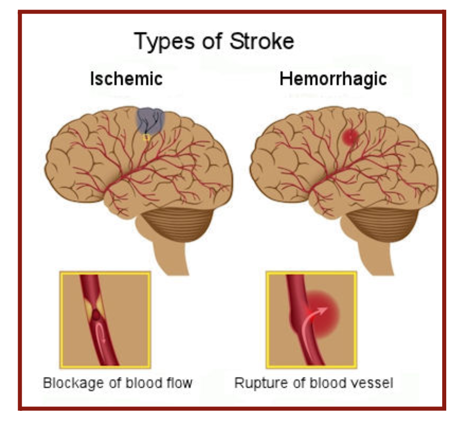
Every year, about 800,000 people in the United States are directly affected by stroke. The two major strokes are ischemic and hemorrhagic (Figure 2.1). Ischemic stroke results from a blocked artery that cuts blood to an area of the brain. North African, Middle Eastern, sub-Saharan African, North American, and Southeast Asian countries had the highest rates of ischemic stroke. Hemorrhagic stroke results from a broken or leaking blood vessel leading to blood spilling into the brain.
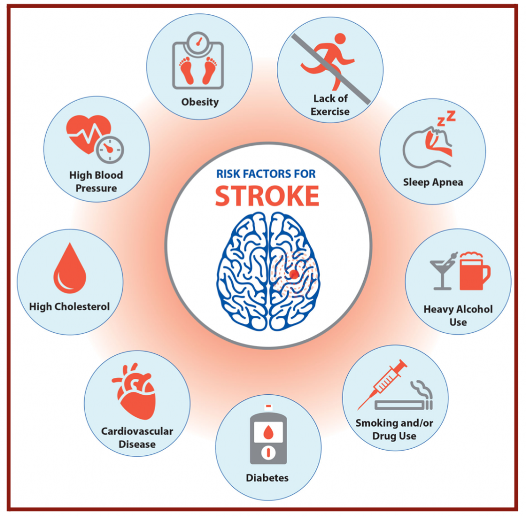
In both cases, the brain does not receive enough oxygen and nutrients, and brain cells begin to die. Risk factors for stroke are old age, overweight, physical inactivity, heavy alcohol consumption, drug consumption, smoking, hypertension, diabetes, and heart disease (Figure 2.2). One in 3 American adults has at least one of these conditions or habits: high blood pressure, high cholesterol, smoking, obesity, and diabetes. In my project, I investigated risk factors in stroke patients to find a correlation and make stroke predictions. Furthermore, I chose to focus my research on American patients since stroke risk factors are much more prevalent in the United States than in other countries.
3. Process of a Data Science Project
In problem-solving, one must follow a particular series of steps and a deliberate plan to reach a resolution. The same technique applies to a data science project. A dataset isn’t enough to solve a problem; One needs an approach or a method that will give the most accurate results. A data science process is a guideline defining how to execute a project. The general steps in the data science process include: defining the topic of research, obtaining the data, organizing the data, exploring the data, modeling the data, and finally communicating the results.
Before starting any data science project, the topic of the research project must be defined. It is critical to brainstorm numerous relevant research ideas and then refine the focus on one worth doing the project. Relevancy is the factor in research that helps both the data scientist and the reader develop confidence about the investigation’s findings and outcome. Relevant research topics can be social, economic, intellectual, environmental, etc., as long as they are up to date. For example, gun control would be a relevant social issue for research, and stroke prediction would be a relevant medical research idea. To get a deeper insight into the topic, thorough research on the specific topic should be conducted and explored, such as reading articles on the internet or talking to an expert on the topic. After developing a high understanding, there should be a general idea of the ultimate purpose and goal of the project. One should ask themselves: “What problem am I trying to solve?” In my case, the problem I am trying to solve is the leading cause of death by stroke annually in the US. The purpose of this project is to use data science to make stroke predictions and further limit the effects of stroke on the population by identifying the early stages of stroke with some correlations regarding stroke. Understanding and framing the problem will help build an effective model that will positively impact the organization.
3.1 Data Acquisition
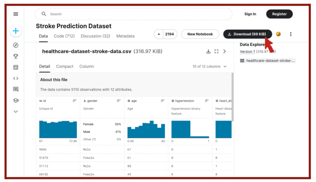
Next, one must find the data to be analyzed in the project. When researching for data, one should discover high-quality and targeted datasets. Not only does the topic of research needs to be relevant but also the data. Data from different sources can be extracted and sorted into categories to form a particular dataset. This process is also known as data scraping. One can find sources on the internet from research centers, government organizations, and specific websites for data scientists, such as Kaggle (Figure 2.3). The data must be accessible, so the most convenient formats for data science are CSV, JSON, or Excel files. Once the datasets have been downloaded, it is necessary to import them into an environment that can directly read data from these data sources into the data science programs. In most cases, data scientists will be using and importing the data into Python or R programming languages. In my case, I downloaded a CSV file of stroke data consisting of patients from the US and their conditions from Kaggle, and then I imported my data into the Juypter Notebook in Python for use.
3.2 Data Cleaning
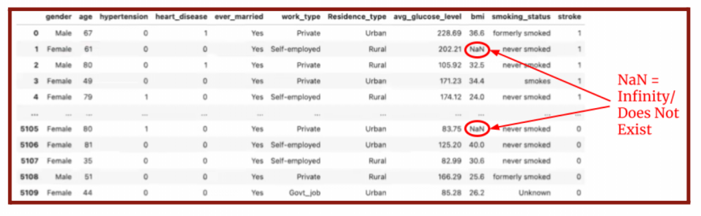
The data acquired and imported is not perfect on its own. Thus, the data must be organized and “clean” to ensure the best quality. Duplicate and unnecessary data are removed, and missing data are replaced. Unnecessary data could be infinities, outliers, or data that does not belong in the sample. For my project on stroke predictions, I removed the data of particular patients from the set if their BMI is infinity (Figure 3.2) or they live outside of the United States, which is the scope of our study.
There are also irrelevant data that are not as obvious and require analyzing the correlation between the parameter and the target. If the correlation is very low, it is irrelevant and should be removed. If there is a missing parameter in the dataset, locate the correct missing data instead and replace it or delete the patient from the dataset. The data is then consolidated by splitting, merging, and extracting columns to organize it and maximize its efficiency. The efficiency and accuracy of the analysis will depend considerably on the quality of the data, especially when used for making predictions.
3.3 Data Exploration
A critical factor in exploring and analyzing the data is to find covariations, as mentioned earlier. Different datasets, such as numerical, categorical, and ordinal, require different treatments. Numerical data is a measurement or a count. Categorical data is a characteristic such as a person’s gender, marital status, hometown, or the types of movies they like. Categorical data can take numerical values, such as “0” indicating no and “1” indicating yes, but those numbers don’t have mathematical meaning. In my case, I used numerical data—for the age, average glucose levels, and BMI—and a categorical dataset—for gender, hypertension, heart disease, marriage status, work, residence, smoking status, and stroke. I detected patterns and trends in the data using visualization features on Python with Numpy, Matplotlib, Pandas, and Scipy. With Numpy and Matplotlib, I could plot linear regressions, bar charts, and a heat map in correlation to select parameters and the target. Using insights made by observing the visualizations and finding correlations, one can start to make conjectures about the problem being solved. This step is crucial for data modeling.
3.4 Data Modeling
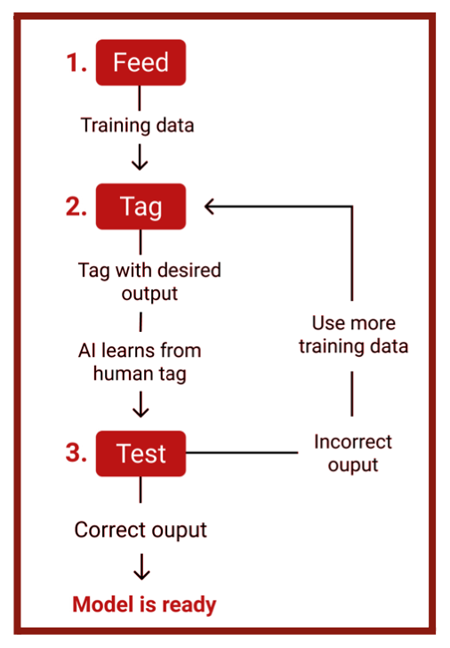
Data modeling is the climax of the data science process. The pre-processed data will be used for model building to learn algorithms and to perform a multi-component analysis. At this stage, a model will be created to reach the goal and solve the problem. In my case, I used a Machine Learning algorithm as the model, which can be trained and tested using the dataset. Machine Learning is the use and development of computer systems that can learn and adapt without following explicit instructions by using algorithms and statistical models to analyze and draw inferences from patterns in data. The first step to data modeling with Machine Learning is data splicing (Figure 3.3), where the entire data set is divided into two parts: training data and testing data. Generally, data scientists split 80% of their data for training and the remaining 20% for testing. The Machine Learning model is fed with the training input data to train the data. The data is then tagged according to the defined criteria so that the Machine Learning model can produce the desired output. During this operation, the model will recognize the patterns within the parameters and target of the training data. Algorithms are trained to associate certain features with tags based on manually tagged samples, then learn to make predictions when processing unseen data. The model will be tested for accuracy with the remaining 20% of the data. Since the correct parameters for each individual in the set are already known, it would be known whether the predictions made by the model are accurate by running the model with the testing data.
The goal is to maximize the model’s accuracy by making final edits and testing it. One may encounter issues during testing and must fix them before deploying the model into production. This stage builds a model that best solves the problem.
3.5 Data Interpretation
The concluding step of the data science process is to execute and communicate the results made from the model. The project is completed, and the goal is accomplished. Consequently, one must present their results to an audience through a research paper or a presentation. The presentation is comprehensible to a non-technical audience. The findings could be visualized with graphs, scatterplots, heat maps, or other conceivable visualizations. Useful data visualization tools for Python are Matplotlib, ggplot, Seaborn, Tableau, and d3js. To visualize the covariance between stroke and its primary causes, I used Matplotlib and Seaborn to create a heatmap. During the presentation, report the results and carefully explain the results’ reasoning and meaning. My ultimate goal is to make predictions for strokes with given patient data, and I hope my research paper will raise awareness of this technology and its global benefits for stroke patients. A successful presentation will prompt the audience to take action in response to the purpose.
4. Machine Learning
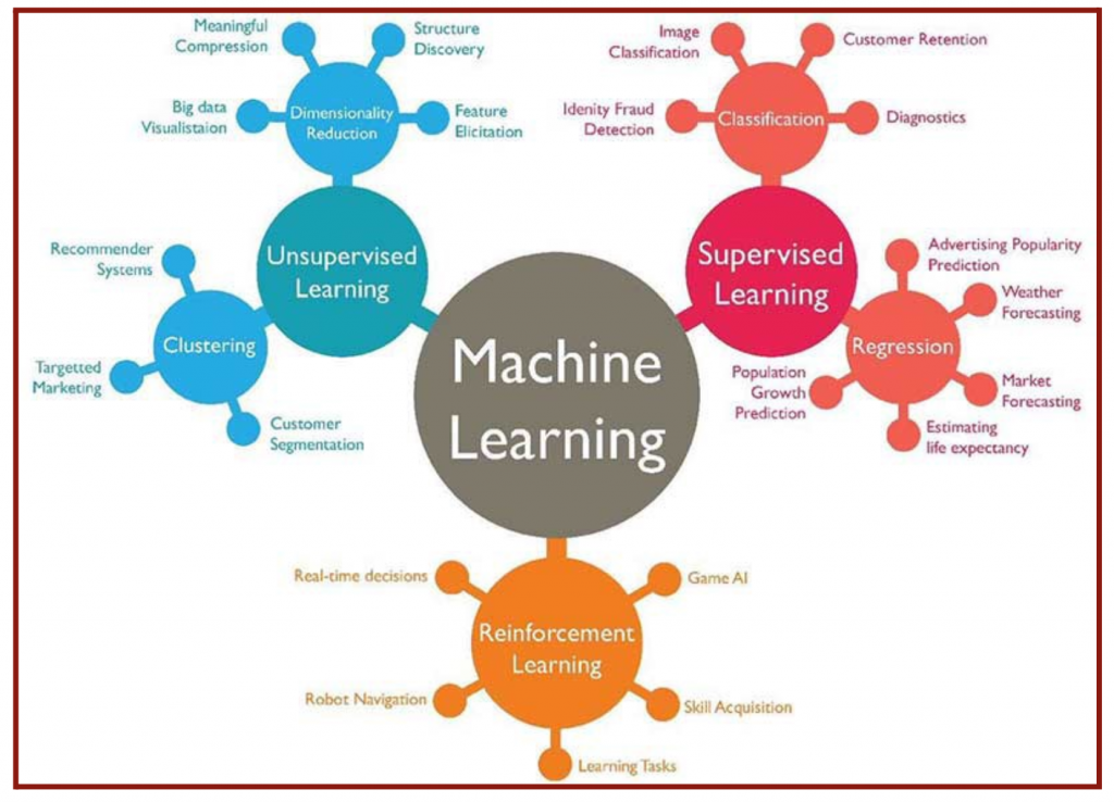
The popularity of Machine Learning, particularly its subset of Deep Learning, has rapidly grown in the past decade with skyrocketing interest in Artificial Intelligence. However, the history of Machine Learning dates back to the mid-twentieth century. Machine Learning is a subset of Artificial Intelligence that imitates human behavior and cognition. The “learning” in Machine Learning expresses how the algorithm automatically learns from the data and improves from experience by constantly tuning its parameters to find the best solution. The data set trains a mathematical model to know what to output when it sees a similar one in the future. Machine Learning can be classified into three algorithm types: Supervised Learning, Unsupervised Learning, and Reinforcement Learning (Figure 4.1). While Supervised and Unsupervised Learning is presented with a given set of data, Reinforcement Learning, known as an agent, learns by interactions with its environment. The agent makes observations and selects an action. When it takes action, it receives feedback rather than a reward or a punishment. Its goal is to maximize rewards and minimize penalties; thus, it would learn and tune its knowledge to take the actions leading to reward and avoid the activities leading to punishment.
4.1 Supervised & Unsupervised Problems
The significant distinction between Supervised and Unsupervised Learning is the labeling status of the given data set. In Supervised Learning, the machine is given pre-labeled data. For my project, I used Supervised Learning and already had data from researchers who labeled each patient with or without stroke. I used a portion of this labeled data to train the model to distinguish which patients have or do not have a stroke based on their given conditions. The system would make a mapping function that uses the pre-existing data to create the best-fit curve or line and make estimations. Subsequently, I used the remaining portion of my labeled data to test the model for its accuracy. The goal is to maximize the accuracy of the model’s approximations when given new input data. In Unsupervised Learning, the machine is given unlabeled and uncategorized data, so it uses statistical methods on the data without prior training. For example, I would be using Unsupervised Learning if I were to predict which of the given patients have diabetes without previous data on diabetes. To form a model, I must analyze the data distribution and separate it based on similar patterns. Without any labeling, I would divide the patients into two groups based on their similar characteristics and behavior. Unsupervised Learning is split into two types: clustering and dimensionality reduction. In clustering, the goal is to find the inherent groupings and reveal the structure of the data. Some examples of clustering would be my previous example of predicting a patient with diabetes, targeted marketing, recommender systems, and customer segmentation. In dimensionality reduction, the goal is to reduce the number of dimensions rather than examples.
4.2 Classification & Regression
Supervised Learning is divided into two types: classification and regression. The goal of classification is to determine the specific labeled group the given input belongs to. The output variable would be a discrete category or a class. The only possibilities for my project are “stroke” or “no stroke.” The given data on the patients trains the model to correlate various parameters—their conditions and behavior—to the corresponding output of “stroke” or “no stroke.” The output could also be a defined set of numbers, such as “0” representing no stroke and “1” representing stroke. The accuracy of its categorization evaluates the classification algorithm. As a result, the model could predict whether a new patient would have a stroke. For regression, the outputs are continuous and have an infinite set of possibilities, generally real numbers. For instance, the machine could be estimating a house’s cost based on its location, size, and age parameters. Standard regression algorithms are linear regression, logistic regression, and polynomial regression.
In the following sections, I will discuss two regression models: linear and logistic regression. The former is used as an introduction to the regression problem whereas, the latter is the algorithm that I used to perform stroke predictions.
4.3 Linear Regression
Linear regression uses the relationship between the points or outputs of the data to draw a straight line, known as the line of best fit, through all of them. This line of best fit is then used to predict output values. A linear function has a constant change or slope and is usually written in the mathematical form:
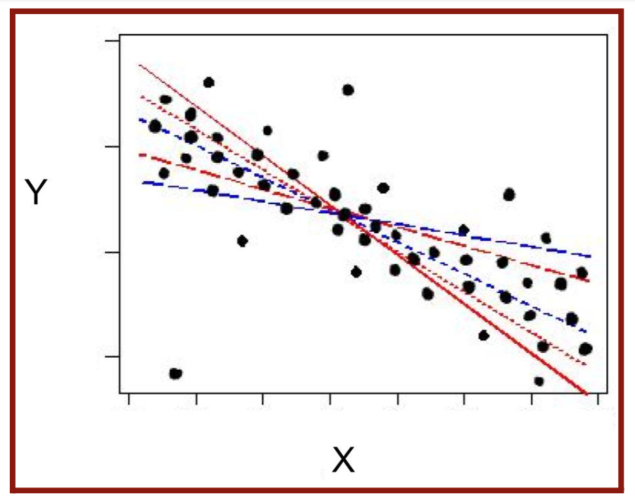
y = θ1x + θ0 (Equation 4.1) where m is the constant slope and b is the y-intercept. When finding the line of best fit, there will be infinite possible straight lines through the values (Figure 4.2), and the θ1-values (slopes) and θ0-values (y-intercepts) will be adjusted. The “θ0” and “θ1” are the two parameters of the function. Regression is the predicting of the exact numeric value the variable would take to have the line of best fit. When given a data set, there exist various x-variables (features or input) and a y-variable (label or output). In my case, the features included gender, age, multiple diseases, and smoking status. The label is stroke or no stroke, listed as “0” and “1.” When using actual data, there will always be a distance between the actual and predicted y-values. This distance, known as the error, is minimized as much as possible to form the best fit line.
The error is often represented by a cost function, which is the sum of the square of the actual output subtracted by the predicted output:

where yi is the real label output, g(x) is the approximation of the output, and (yi – g(x)) is the error. The error is squared to ensure that the result of the cost function will be the sum of positive values. The line of best fit is created when the mean square error is the smallest it can be. In Machine Learning, the data receives training to find the line of best fit using Gradient Descent, an optimization algorithm to find the local minimum of a differentiable function. The Gradient Descent can be represented with the formula:
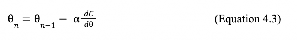
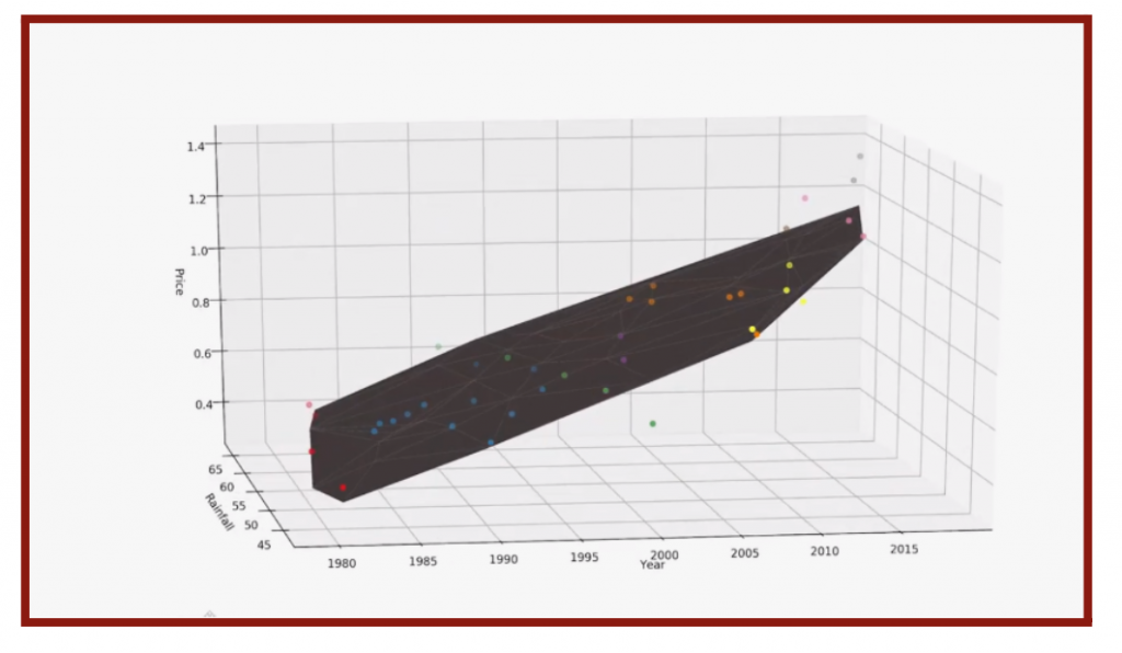
where ⍺ is the learning rate and ![]() is the instantaneous rate of change of the cost function at θ. The learning rate determines the magnitude of each increment of each step. Data scientists often make 0. 001 < ⍺ < 0. 01 because an ⍺ too large will never converge to the minimum and ⍺ too large will never converge to the minimum and ⍺ too small will take too long to reach the minimum. Moving down the function of C(θ), θn and θn – 1 approach each other. Once the difference is very small or |θn – θn-1| < 0. 001, the line of best fit is found. One example of linear regression would be the number of sales based on the product’s price. There would be a set of data with various products at different prices (the inputs) and each of their sales (the outputs). Assuming the trend of the relationship between the costs and the sales is linear, one would be able to find a linear model with the slightest mean square error. Thus, one can predict the number of sales at a new price. When two inputs or independent variables exist, the function becomes three-dimensional (Figure 4.3), and the model becomes a plane of best fit.
is the instantaneous rate of change of the cost function at θ. The learning rate determines the magnitude of each increment of each step. Data scientists often make 0. 001 < ⍺ < 0. 01 because an ⍺ too large will never converge to the minimum and ⍺ too large will never converge to the minimum and ⍺ too small will take too long to reach the minimum. Moving down the function of C(θ), θn and θn – 1 approach each other. Once the difference is very small or |θn – θn-1| < 0. 001, the line of best fit is found. One example of linear regression would be the number of sales based on the product’s price. There would be a set of data with various products at different prices (the inputs) and each of their sales (the outputs). Assuming the trend of the relationship between the costs and the sales is linear, one would be able to find a linear model with the slightest mean square error. Thus, one can predict the number of sales at a new price. When two inputs or independent variables exist, the function becomes three-dimensional (Figure 4.3), and the model becomes a plane of best fit.
4.4 Logistic Regression
The data may not always fit into a linear model. For my data set on stroke predictions, the only two possible labels are stroke and no stroke or “0” and “1,” which is an example of binary classification. Thus, linear regression is non-ideal in the case of binary classification.
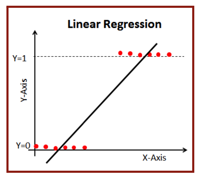
The line of best fit would exceed the 0 and 1 range and not be a good representation of the data, as seen in Figure 4.4. That’s why we will be using a logistic function to model the data. A logistic function, also known as a sigmoid curve, is an “S”-shaped curve (Figure 4.5) that can be represented by the function:
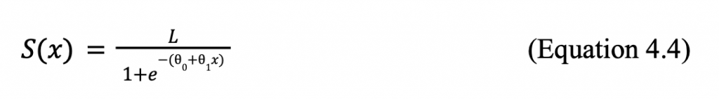
where L is the curve’s maximum value and (θ0 and θ1x) = g(x) or the linear regression function.
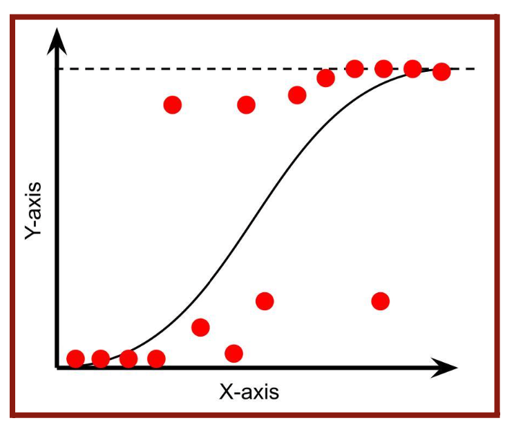
In the case of a common sigmoid function, the output is in the range of 0 and 1, so L would be 1. There exists a threshold at 0.5; Outputs less than 0.5 will be still to 0 while outputs greater than equal to 0.5 will be set to one. Logistic regression finds the curve of best fit or the best sigmoid function for the given data set. For linear regression, we found the line of best fit with Gradient Descent. For logistic regression, we will use the Cross-Entropy Loss Function to determine the curve of best fit. Cross-entropy loss is the sum of the negative logarithm of the predicted probabilities of each model. For my case, I had only two labels and used Binary Cross-Entropy Loss which can be represented in the formula:
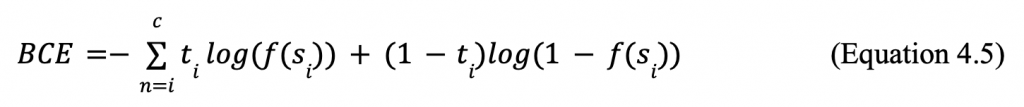
where si is inputs, f is the sigmoid function, and ti is the target prediction. The goal is to minimize the loss; thus, the smaller the loss the better the model. When the best sigmoid function is found, the Binary Cross-Entropy should be very close to 0. The machine completes most of the logistic regression process internally, so it will solve and find the best function, which can be applied to make accurate predictions.
5. Process of Stroke Prediction Project
In the following session, I will apply the previous machine learning skills, specifically the logistic regression algorithm, to the case of stroke predictions. The data set introduced in Section 2 and the data science project process discussed in Section 2 will be used. I will describe the process of my project in detail and explain the analysis involved in interpreting the accuracy and efficiency of my model.
5.1 Data Acquisition
Before I started the data science research project, I researched various topics and current events and chose to do my project on stroke prediction. I obtained my organized data from the Kaggle website, which allowed me to download the file as a CSV file conveniently. I used the Jupyter Notebook application via Anaconda as my environment for this project. I imported my downloaded CSV file to the notebook (Figure 5.1).
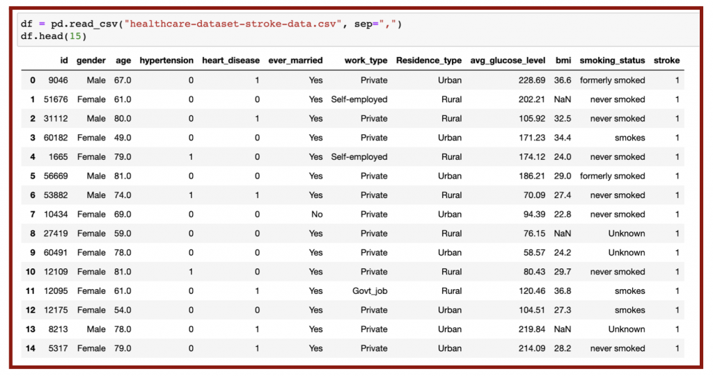
As seen in the top row of Figure 5.1, there are various parameters or features: gender, age, hypertension, heart disease, marriage status, work type, residence type, average glucose level, BMI, and smoking status. The output or target I investigated was whether or not the patient had a stroke. The variables hypertension, heart disease, and stroke are defined by “0” being no and “1” being yes.
5.2 Data Cleaning
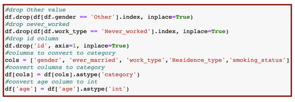
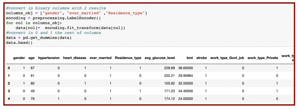
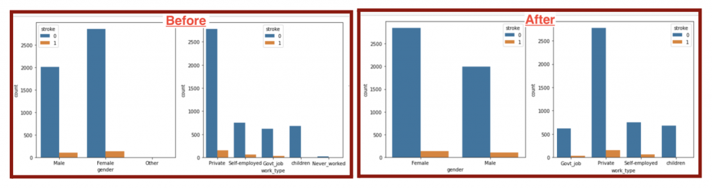
During the data cleaning process, I removed the redundant data for clarity by deleting other values in gender, never_worked values from work_type, and the id column (Figure 5.2 & Figure 5.4). In addition, I labeled all categorical features, or non-numerical columns, as ‘category’ when converting them into numerical values for analysis (Figure 5.2 & 5.3). Since the age values are non-integers, I converted them into integers in the last row of my code (Figure 5.2).
The next part of data cleaning is removing outliers. I identified those outliers by recognizing the “null” or nonexistent values (Figure 5.5), labeled as NaN in the data as seen previously in Figure 3.2. Any non-zero output means there is a presence of outliers.
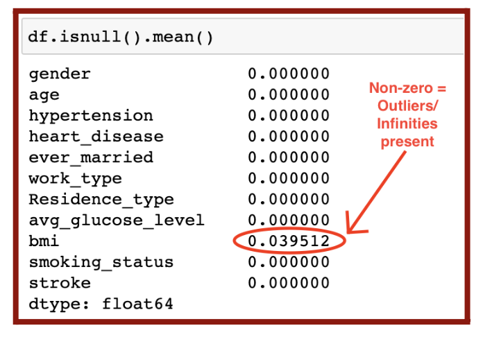
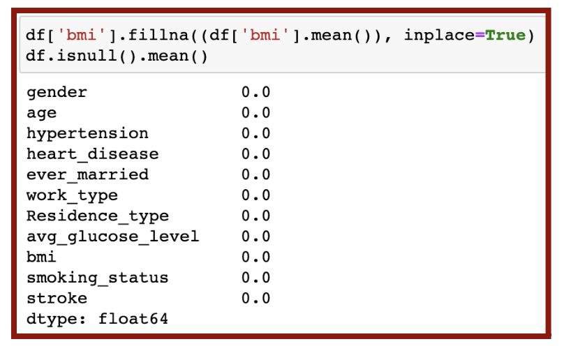
In my dataset, the only outlier was BMI. Thus, I removed those outlier values and replaced them with the mean BMI value in the code in Figure 5.6. I was confident no more null values were present in my data since all outputs were zero.
5.3 Data Balancing
Even after data cleaning, my dataset was not yet ready for use after data cleaning due to imbalance. Imbalanced data refers to the issue in classification when the classes or targets are not equally represented. The number of patients with stroke was much higher than without stroke (left plot in Figure 5.8). To create a fair model, the number of patients in stroke and no stroke classes must be equal. I could have resampled the data by undersampling (downsizing the larger class) or oversampling (upsizing the smaller class). I chose to oversample with the SMOTE algorithm (Figure 5.7) because the number of patients in the stroke class was too small and would lower the accuracy with undersampling.
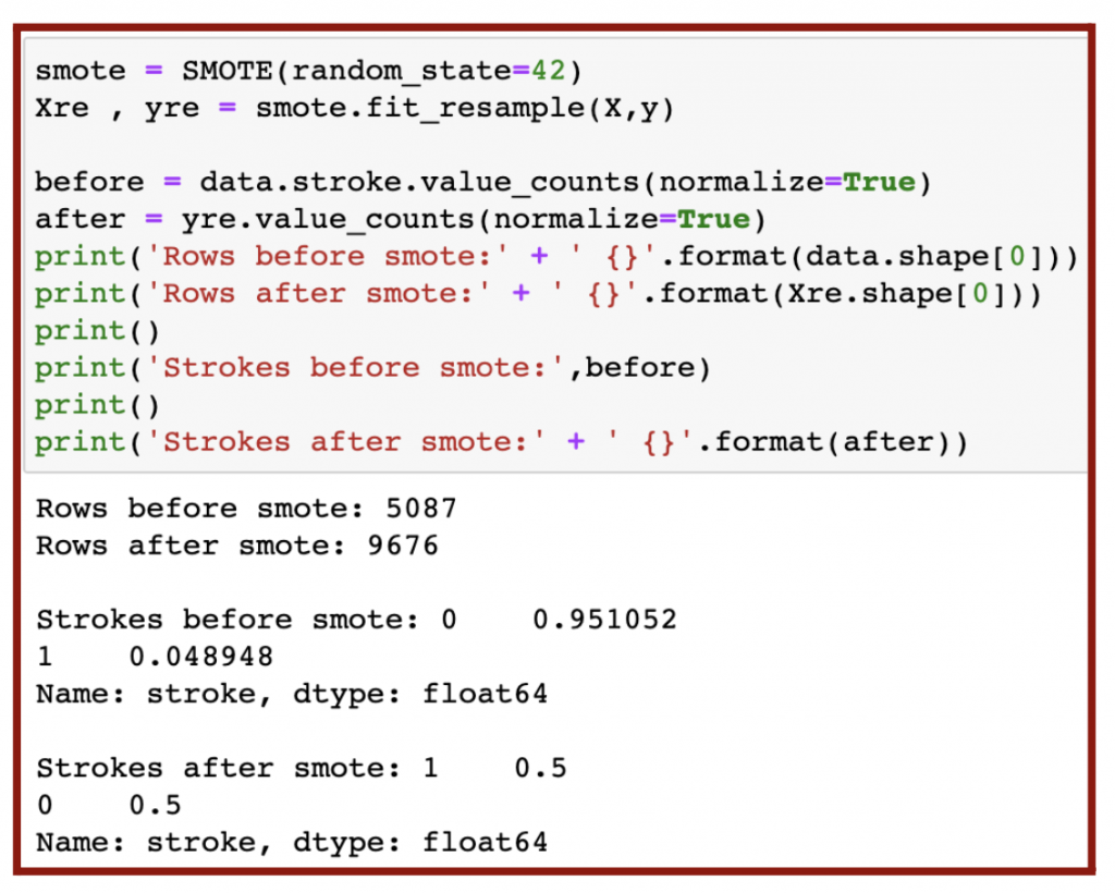
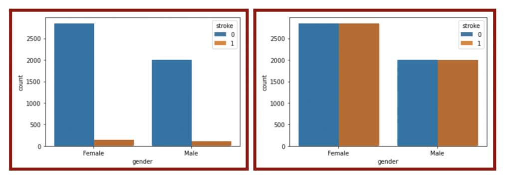
As a result of the oversampling, the ratio of stroke to no stroke should be 1:1 and thus balanced (Figure 5.7 & right plot in Figure 5.8).
5.4 Data Modeling
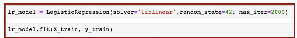
After dividing the resampled data into 80% training and 20% testing, I created a logistic regression model with the training data (Figure 5.9).
The logistic regression algorithm was imported from sklearn.linear_model and automatically found the best fit curve representing the dataset.
5.5 Data Performance
In order to determine the accuracy of my model, I found the mean square error or MSE (from Equation 4.2). The MSE could be found with three methods: score method, sklearn.metrics, and equation (Figure 5.10).
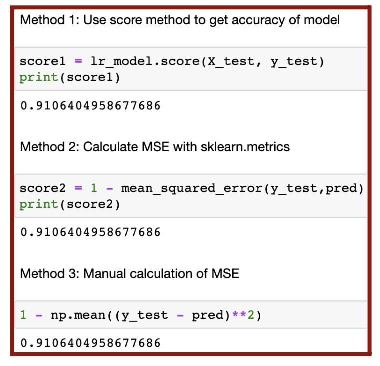
As a result, my model had approximately 91.1% accuracy. For a more detailed understanding of the model’s performance, I used a confusion matrix, which is a 2×2 table dividing the accuracy of the data into four categories (Figure 5.11).
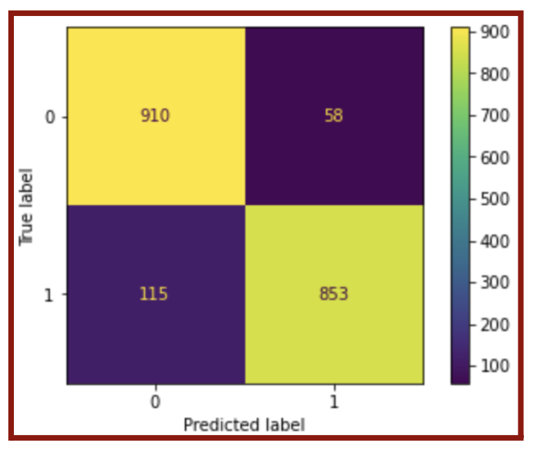
The four categories, as shown in Figure 5.11, are true positive (bottom right), true negative (top left), false positive (top right), and false negative (bottom left). The accuracy of the model is high as long as most of the results are in the true positive and true negative categories because the predicted values are equal to the actual values. Using the confusion matrix, I further analyzed the performance of the model by calculating the F-1 score (Equation 5.1 & Figure 5.12). The F-1 score shows not only accuracy but also precision. I used the sklearn.metric algorithm to calculate my F-1 score (Figure 5.12), but I also could have used the equation.
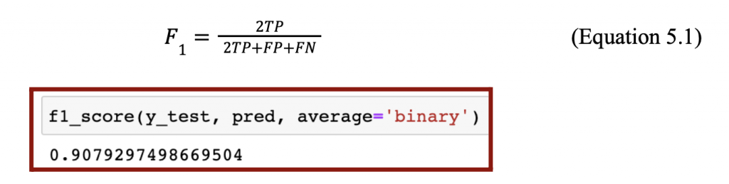
As a result, my model had an F-1 score of approximately 90.8%. Both my MSE and F-1 score were above 90.0%, and thus my model had high accuracy and precision.
5.6 Features Selection
Although my model already had high performance, I attempted to further increase it by removing certain features from my data. I hypothesized that the accuracy would improve if I removed the unimportant features or features with little correlation to the presence of stroke. On the other hand, the accuracy would drastically decrease when I removed important features. I determined the important and unimportant features with a correlation matrix plot (Figure 5.13).
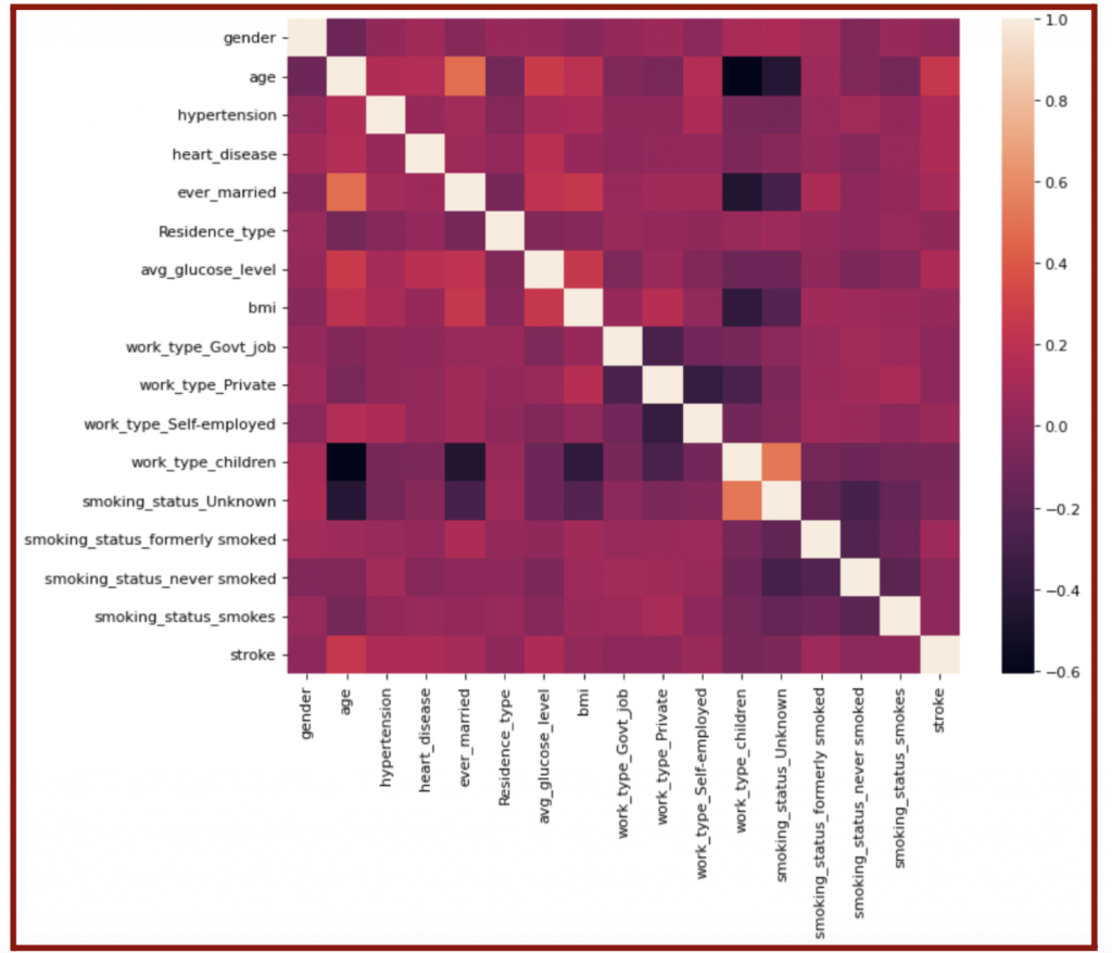
The labeled bar on the right of Figure 5.13 shows the correlation between the features and output. The algorithm found the correlation with the following equation:
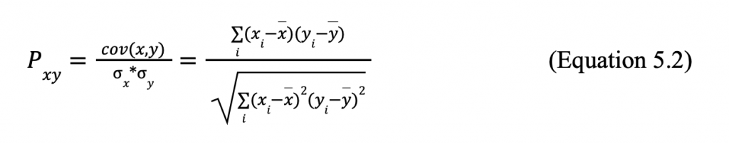
Where cov is the covariance, ox is the variability of x with respect to the mean (the variance), xi is an output of function x, x is the mean of x, and the y-variables have the same meanings using the y data set. When used to find the correlation between the parameters and stroke, I focused on the right-most column of the map. A correlation of 1.0 means the trends of the feature and output are equivalent, while a correlation of -1.0 means the trends of the feature and output are completely opposite. Both types of correlation are considered crucial when creating the logistic regression model. On the other hand, the feature and output are entirely unrelated if the correlation is 0. Therefore, I considered the features with a correlation close to 0—gender, residence type, children, and unknown smoking status—unimportant and removed them from my dataset (Figure 5.14).

After the removal, I repeated the processes of splitting the data, training the data, creating the logistic regression model, and calculating its accuracy with MSE and F-1 scores. Surprisingly, the accuracy and F-1 score lowered to approximately 86.6%; hence, the data removal led to a smaller training set and thus a less accurate and precise model. I further tested this theory by removing the important features or only keeping the features deemed unimportant and then repeated the data modeling process. Understandably, the accuracy lowered to 66.2%, and the F-1 score reduced to 71.9%. In conclusion, I kept my original model with all the features because it had the highest accuracy and precision.
6. Conclusion
In this data science project, I applied Machine Learning algorithms into predicting the likeliness of a patient in the United States to have a stroke. The goal of making such predictions is to prevent the consequences of stroke, which impacts a large population of Americans today. Throughout the project, I closely followed each step of the data science project process: data acquisition, data cleaning, data exploration, data modeling, and data interpretation. I discussed the difference between Supervised and Unsupervised Learning is whether the given data is labeled. Within Supervised Learning, there is Classification, using categorical data, and Regression, using numerical data. These data sets can be modeled with linear and logistic regression. In my project, I used a logistic regression algorithm to test and train my data. As a result, I tested my model with MSE and F-1 scores, and my model had an accuracy of 90%, which is a very promising outcome. To ensure the highest accuracy has been reached, I removed features with low correlation deemed unimportant and features with high correlation deemed important. The removal of important features led to a drastic drop in accuracy, and thus those features of the dataset should continue to be collected and studied for stroke predictions. Meanwhile, the removal of the irrelevant features had a small drop in accuracy, so those features are still of good use and are to be collected with the important features in this study. There may be other factors that play a role in the risk of stroke, however, the factors I have mentioned are of greatest significance based on the accuracy of my model.
Works Cited
Yeung, C. (2022, August 11). Stroke_Predictions_Project_Charisse_Yeung.ipynb. GitHub. Retrieved September 3, 2022, from https://github.com/honyeung21/data_science/blob/main/Stroke_Predictions_Project_Charis se_Yeung.ipynb
Medlock, B. (2022). Stroke. Headway. Retrieved September 3, 2022, from https://www.headway.org.uk/about-brain-injury/individuals/types-of-brain-injury/stroke/
Initiatives, C. H. (n.d.). Stroke prevention. CHI Health. Retrieved September 3, 2022, from https://www.chihealth.com/en/services/neuro/neurological-conditions/stroke/stroke-prevent ion.html
Fedesoriano. (2021, January 26). Stroke prediction dataset. Kaggle. Retrieved September 3, 2022, from https://www.kaggle.com/datasets/fedesoriano/stroke-prediction-dataset
Wolff, R. (2020, November 2). What is training data in machine learning? MonkeyLearn Blog. Retrieved September 3, 2022, from https://monkeylearn.com/blog/training-data/
Pant, A. (2019, January 22). Introduction to machine learning for beginners. Medium. Retrieved September 3, 2022, from https://towardsdatascience.com/introduction-to-machine-learning-for-beginners-eed6024fd b08
V.Kumar, V. (2020, May 28). ML 101: Linear regression. Medium. Retrieved September 3, 2022, from https://towardsdatascience.com/ml-101-linear-regression-bea0f489cf54
Gupta, S. (2020, July 17). What makes logistic regression a classification algorithm? Medium. Retrieved September 3, 2022, from https://towardsdatascience.com/what-makes-logistic-regression-a-classification-algorithm- 35018497b63f
About the author
Charisse Yeung
Charisse is currently a 12th grader at the Carlmont High School in California. Her academic interests are data science, computer science, healthcare, and mathematics.